BRANDING & PACKAGE DESIGN
A delicious new look and package for a freeze dried sweet treat brand.
THE PROJECT
Create a brand character and identity design that sets Uncle Crunch up to seize their market.
THE PROCESS
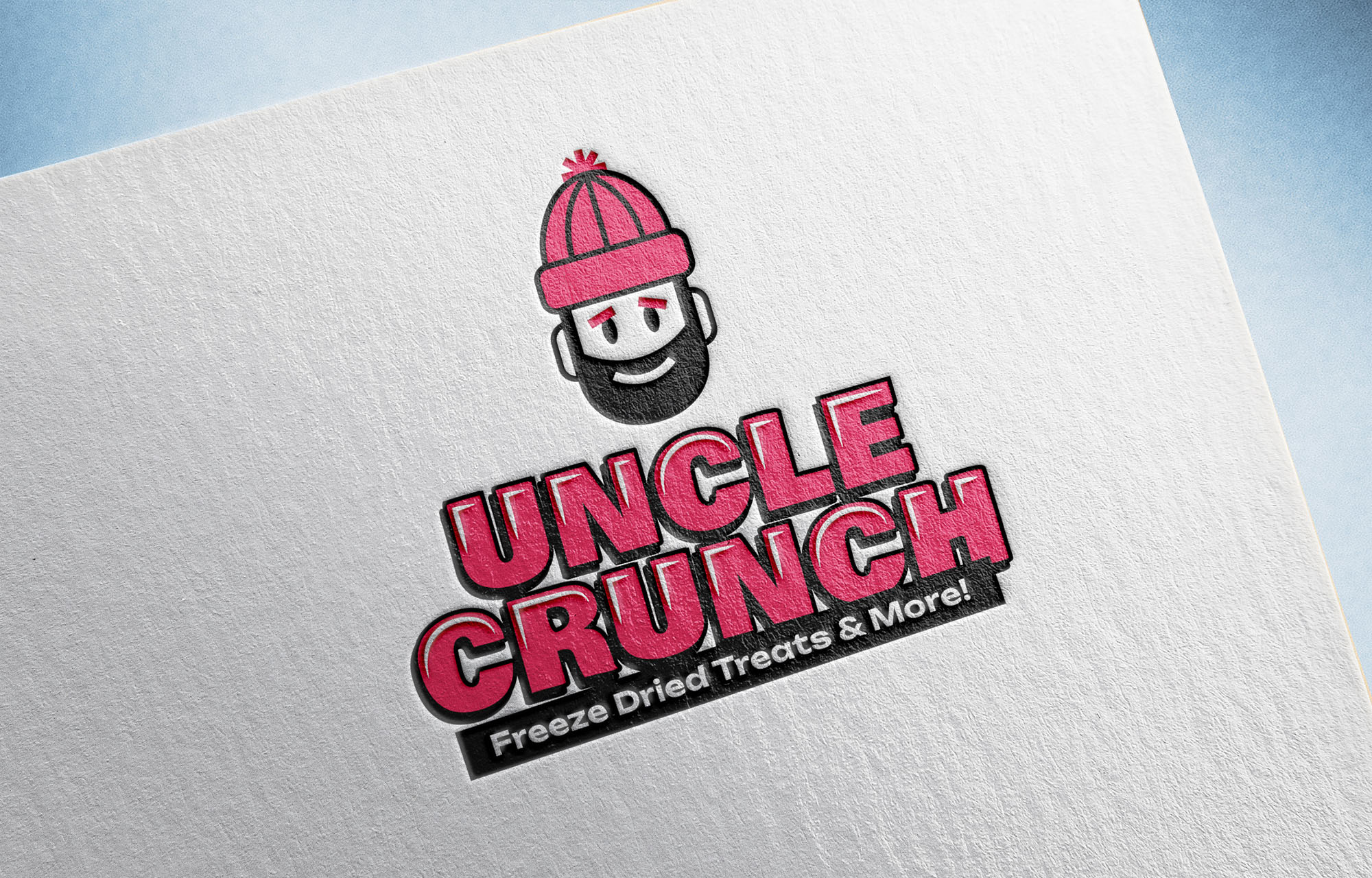
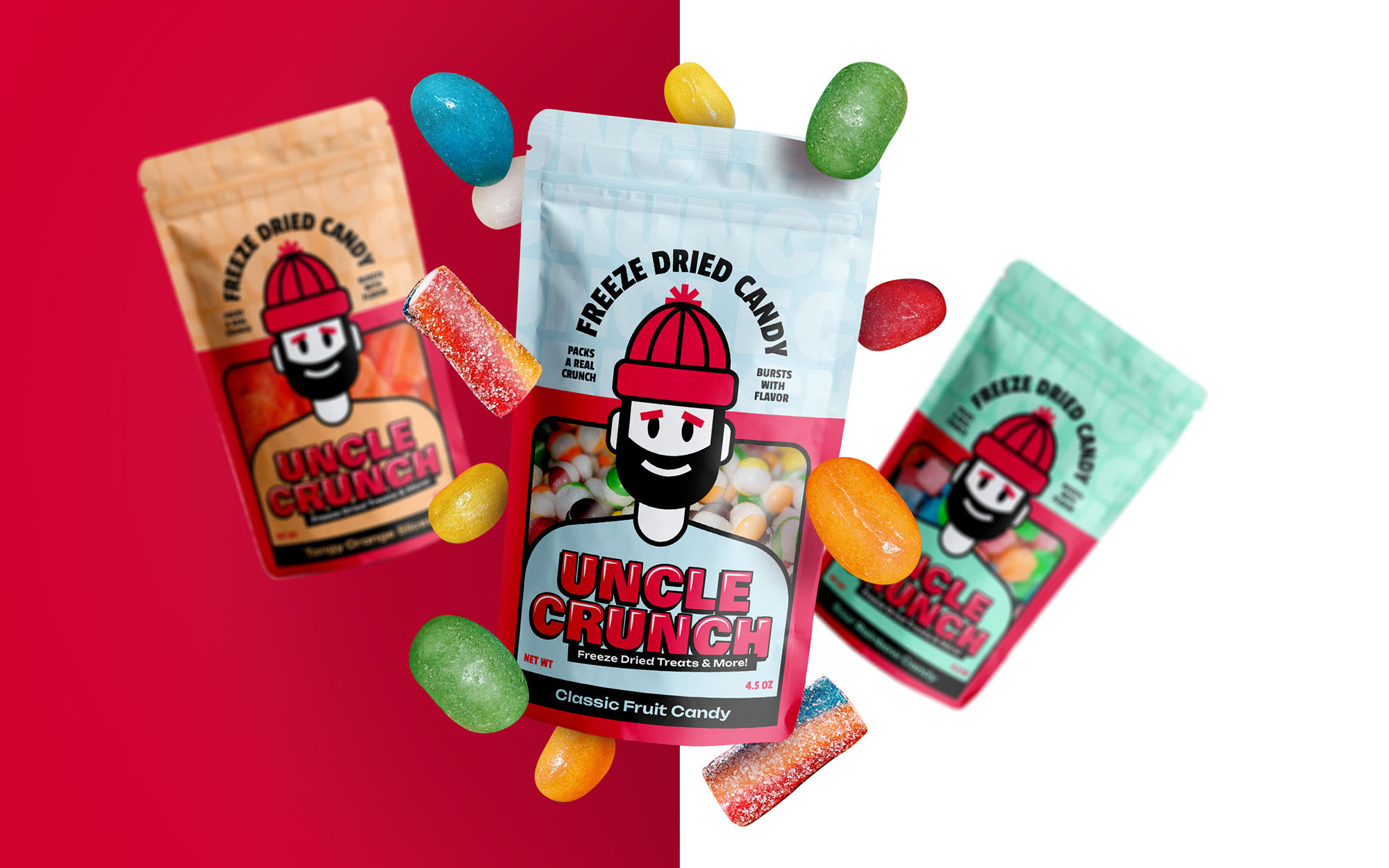
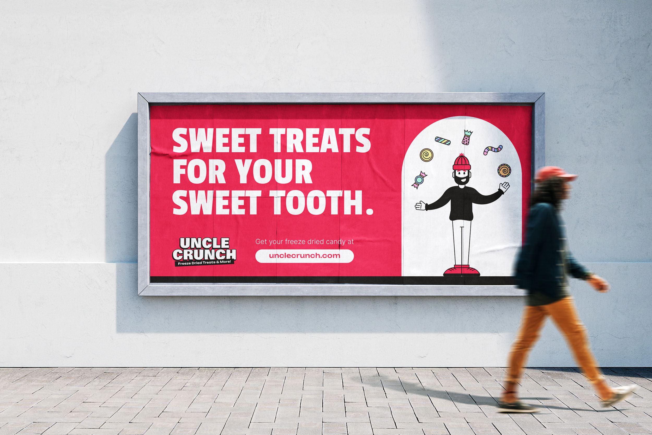
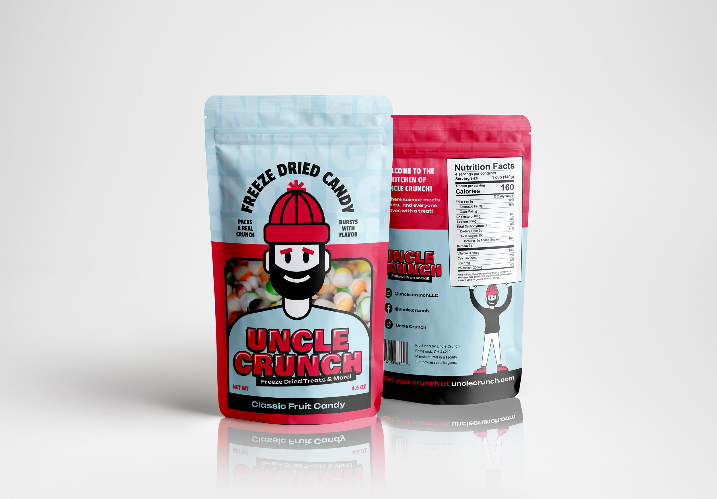
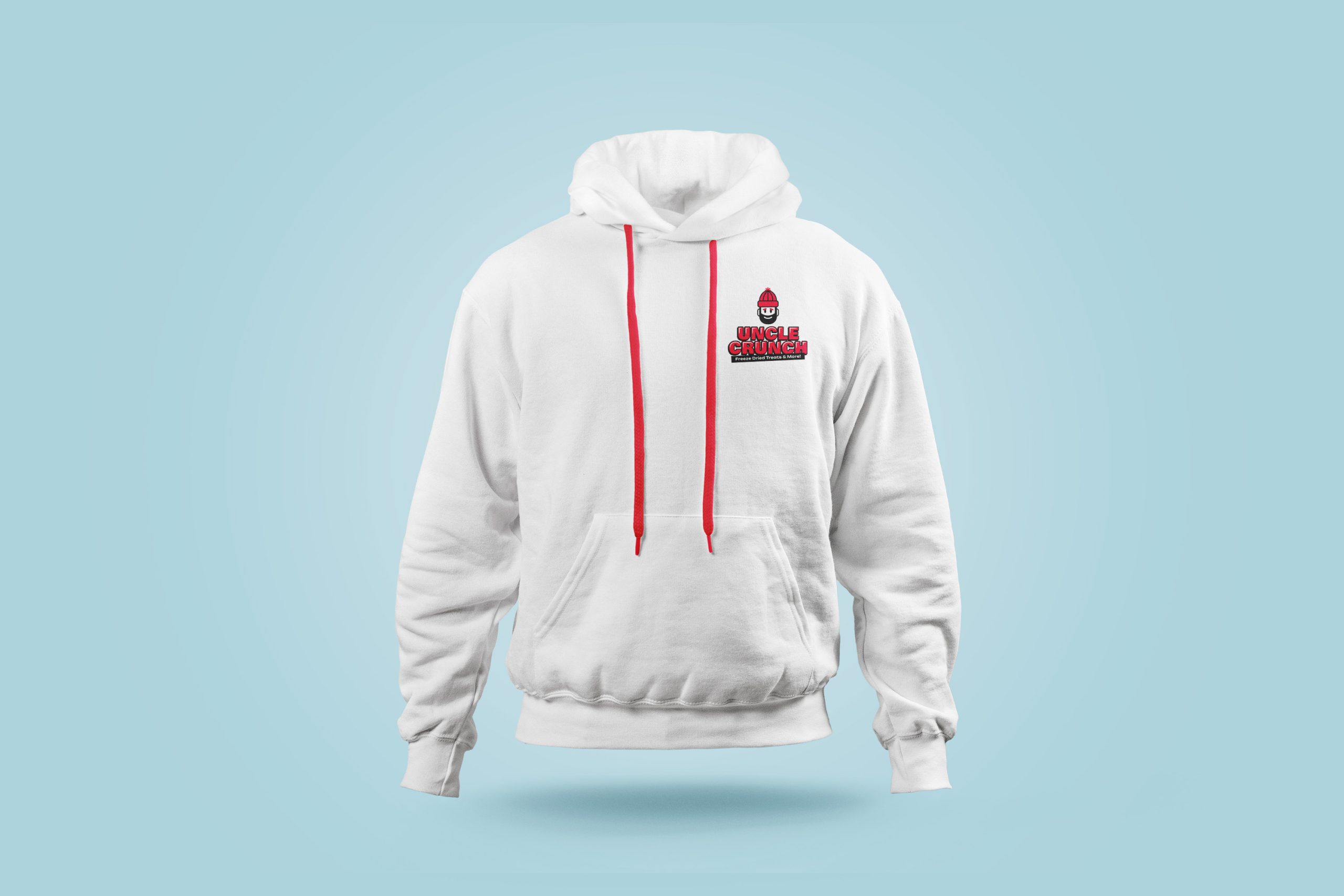
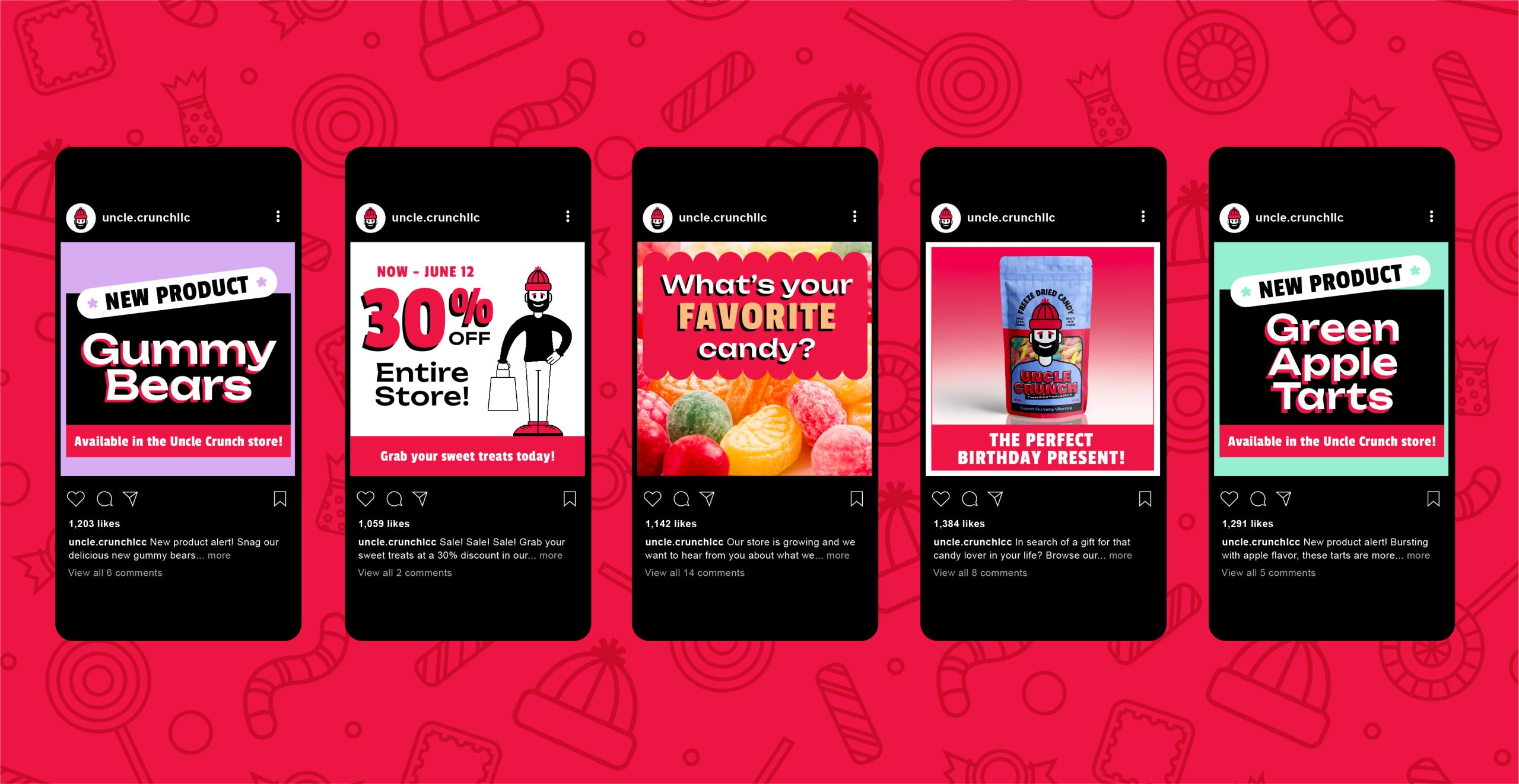
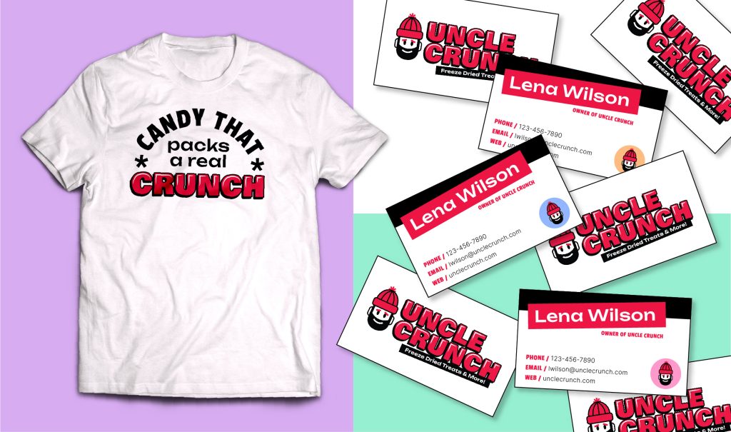
Running with owner Lena Wilson’s idea of a red beanie, we created the Uncle Crunch character in a minimal, impactful style. We let red be the hero color, with a soft pastel palette to be used for different flavors. Chunky typography helped give a knock-out punch, creating a sweet identity system that flexes across the entire brand.
THE PRAISE

“Madison is absolutely brilliant! Her work is beautiful and she was so easy to work with. She listened but also heard what I couldn’t articulate to create the most amazing logo and branding!”
– Lena Wilson, Owner
