We refined and polished the look of a renowned international school.
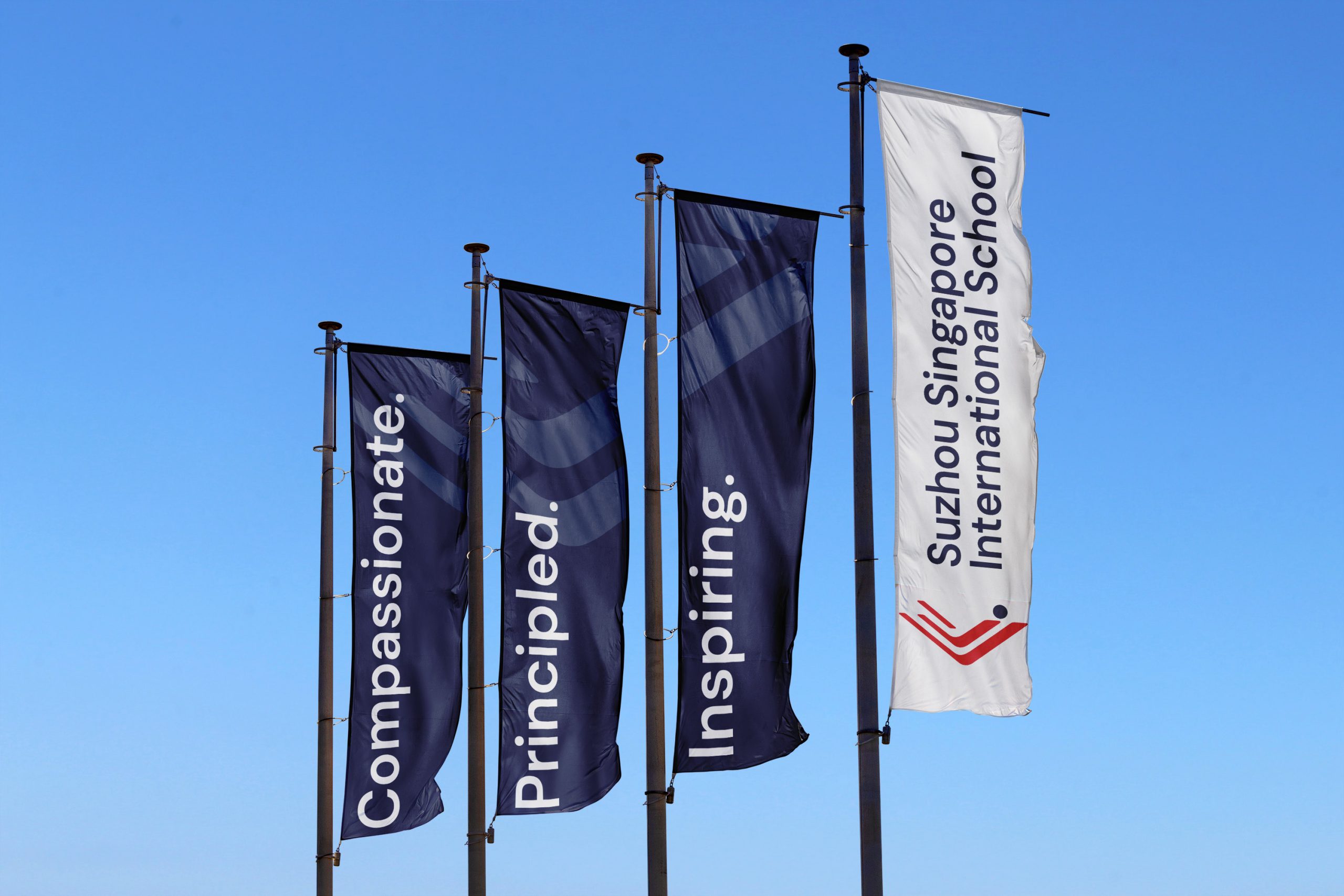
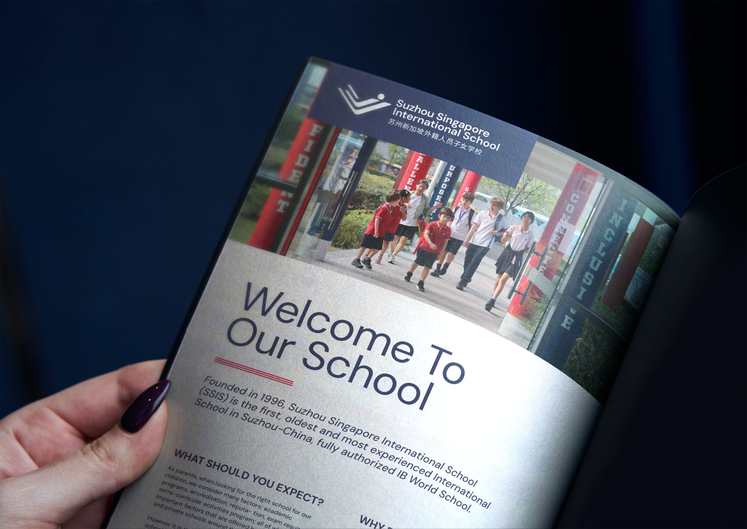
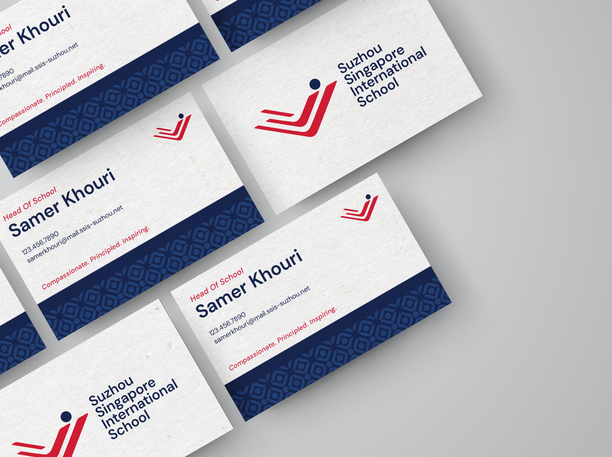
Suzhou Singapore International School (SSIS) has a long history of successfully serving expat families. They are a well-established school, synonymous with academic success. Their logo had garnered recognition in the community, but they lacked an established visual system for the brand. They also needed refined typography for their logo, along with a fuller logo family for different usages.
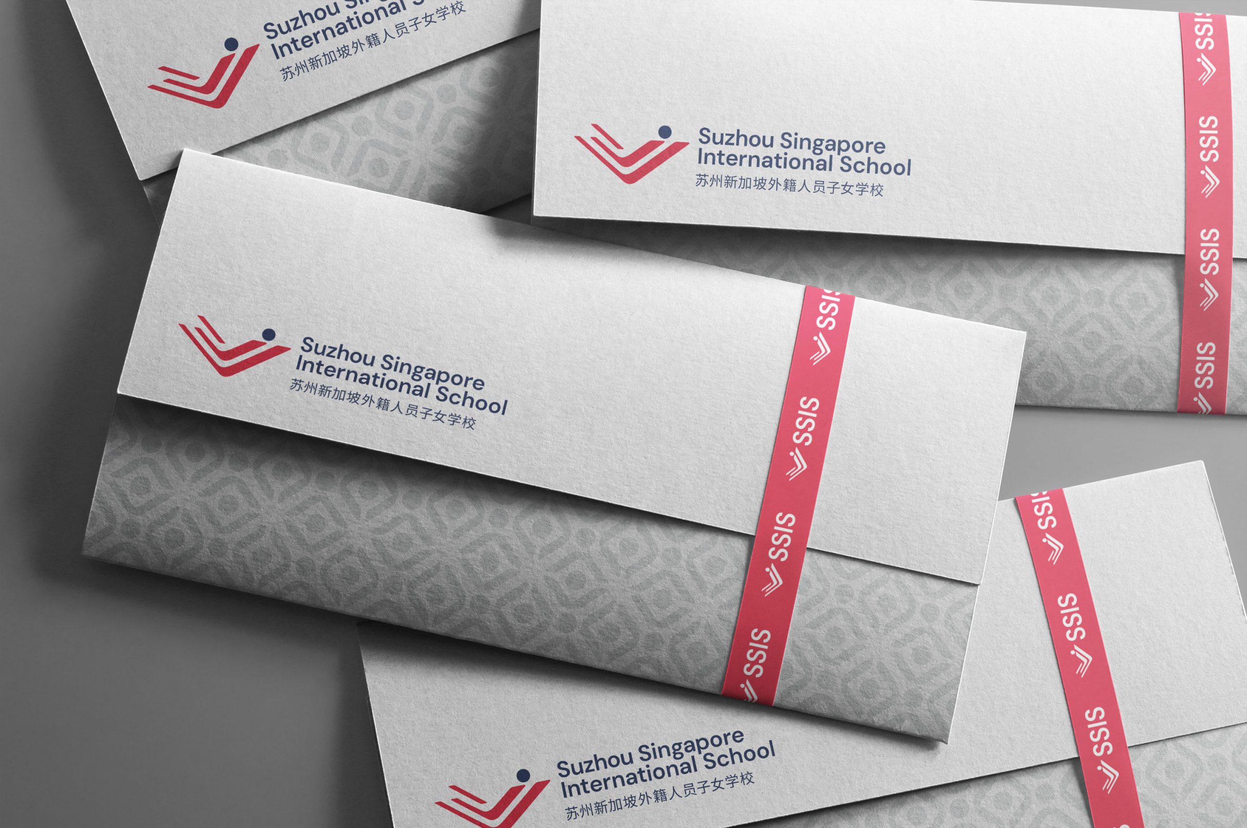
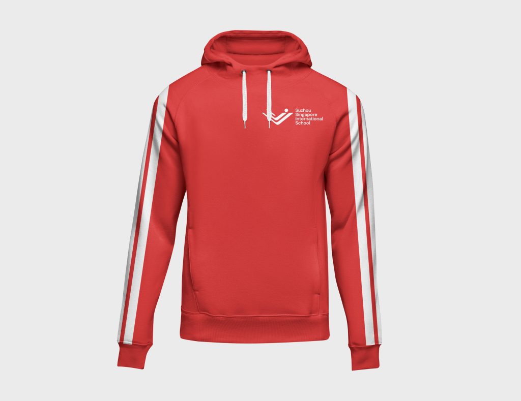
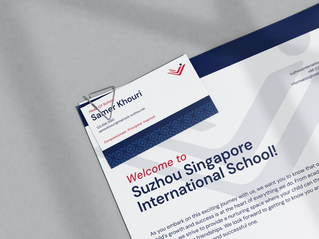
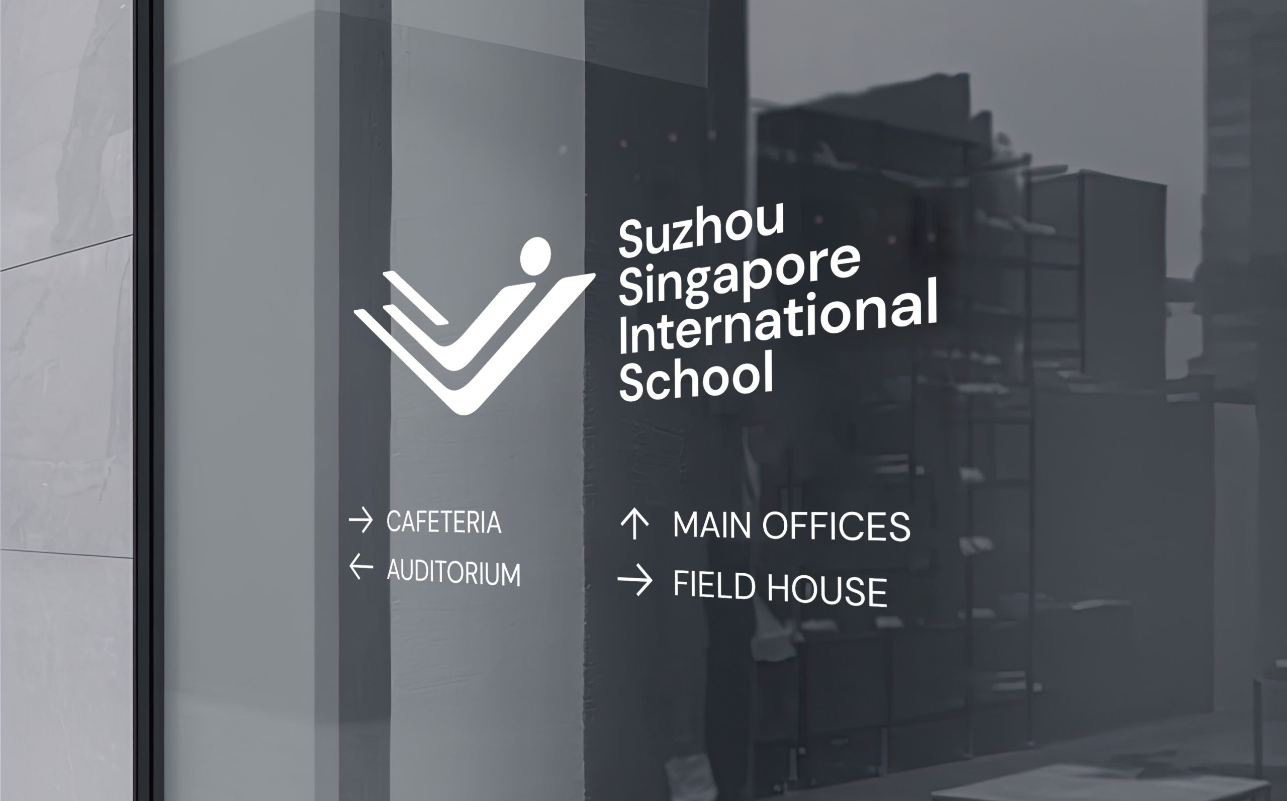
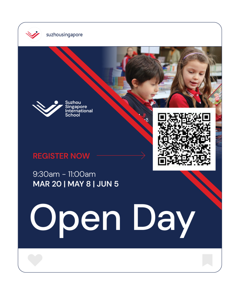
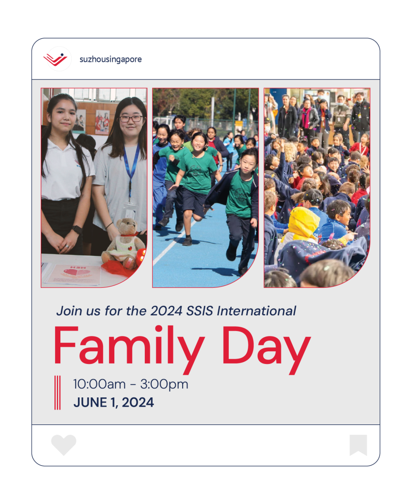
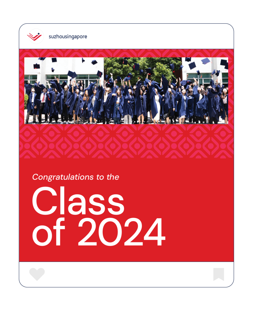
SSIS engaged with Creative Chameleon to look at their current brand and identify the ways it could be evolved and polished. We started with their logo, cleaning up the icon and then reimagining the wordmark and typography to support it. We gave great attention to creating a refreshed logo that was balanced and aligned. To make sure they have a fully functioning visual brand, we also crafted a handful of logo variations, from a stacked to a multi-language to an abbreviated logo. This logo library will help them maintain consistency in all the areas that a school uses a logo.
Once the logo was refined, we refreshed their house system logos and developed a new brand pattern. Taking all the approved creative work, we design brand guidelines that defined the new visual system for SSIS, from logo usage to new typography to patterns and colors.
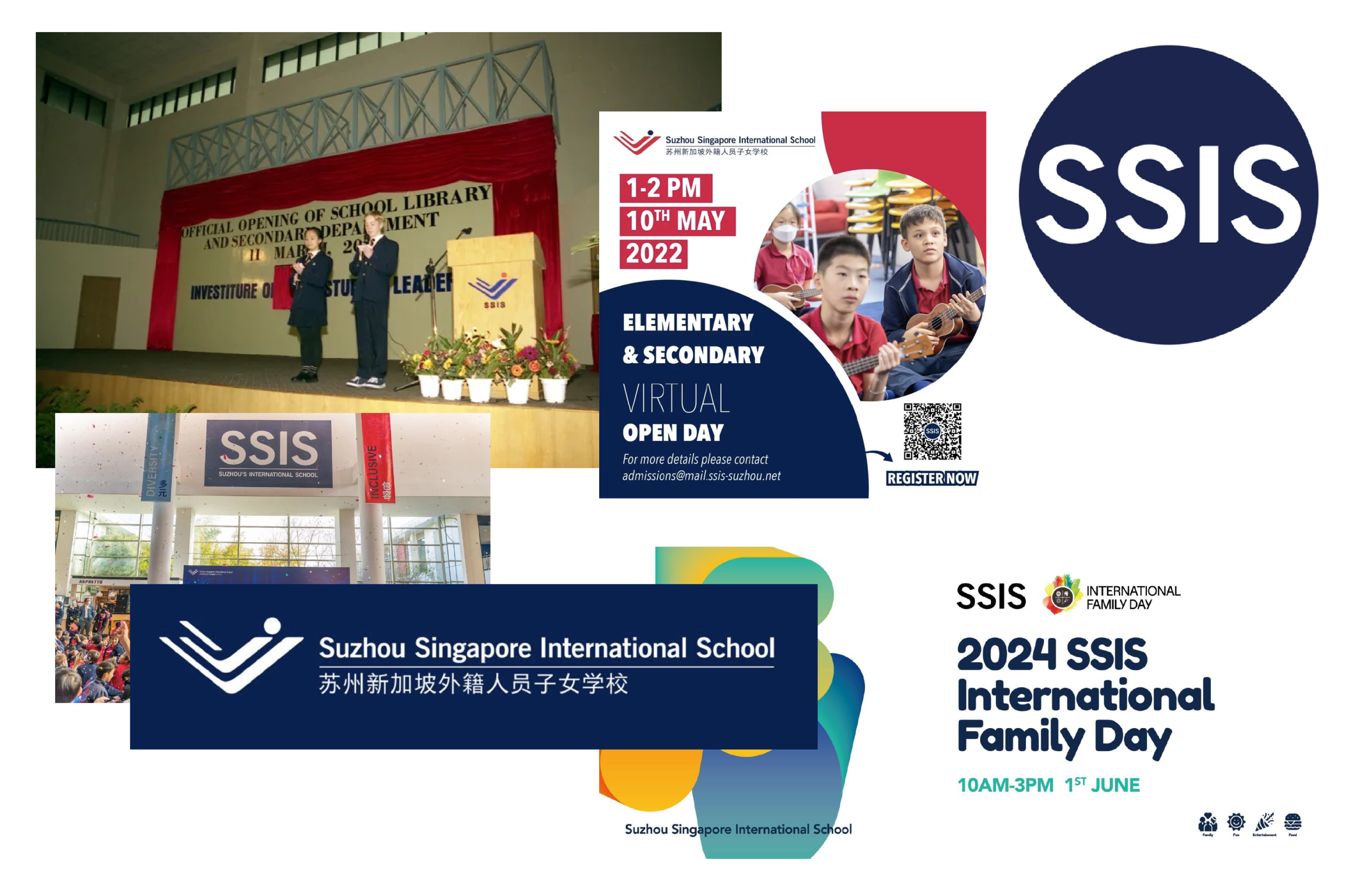
EXAMPLES OF OLD IDENTITY DESIGN
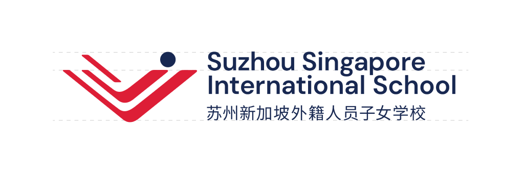
LOGO DESIGN EVOLUTION
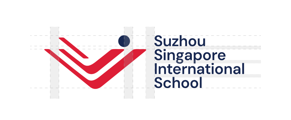
LOGO CONSTRUCTION
“The communication has been incredibly efficient. They consistently understood our requests for edits and delivered work that aligned perfectly with our vision. The final results have pleased the school leadership team immensely. We will definitely consider working with Creative Chameleon on future projects.”