We refined and refreshed the logo and identity for this long-standing school.
PROJECT OVERVIEW
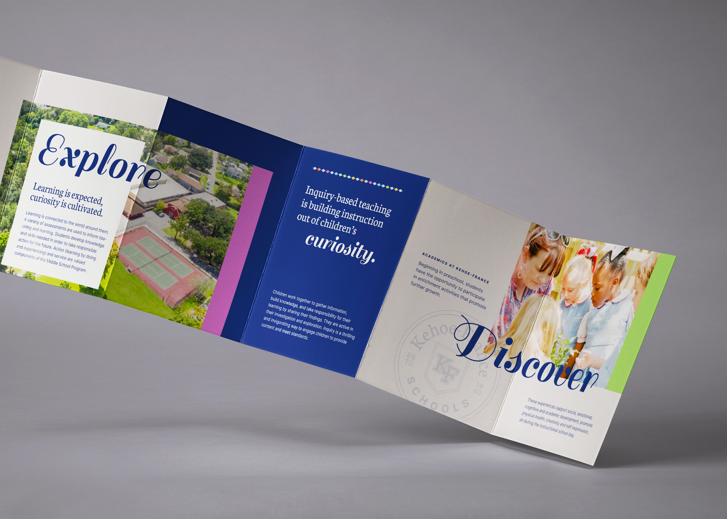
Kehoe-France Schools has a long history of a tight-knit student body and stellar academic offerings. But their identity system was disjointed, their logo hard to use, and their overall look mismatched with the modern atmosphere within their walls. So we took what they had, kept the heart behind it, and gave it a fresh look.
REDESIGNING A LOGO
We started by exploring ways to polish the monogram. Because it was well-known in the community, we wanted to keep it recognizable, but more balanced and easy to use. Once we had the improved monogram, we added a simple shield crest to ground it and give it flexibility.
CRAFTING A SYSTEM
Once the crest was finalized, we gave the typography an upgrade and developed a library of logo variations to cover different usages. Then, with a fresh color palette and supporting assets, Kehoe-France Schools had a new identity that touched every corner of their brand.