ELECTRIC EXPO 2019
Identity Design
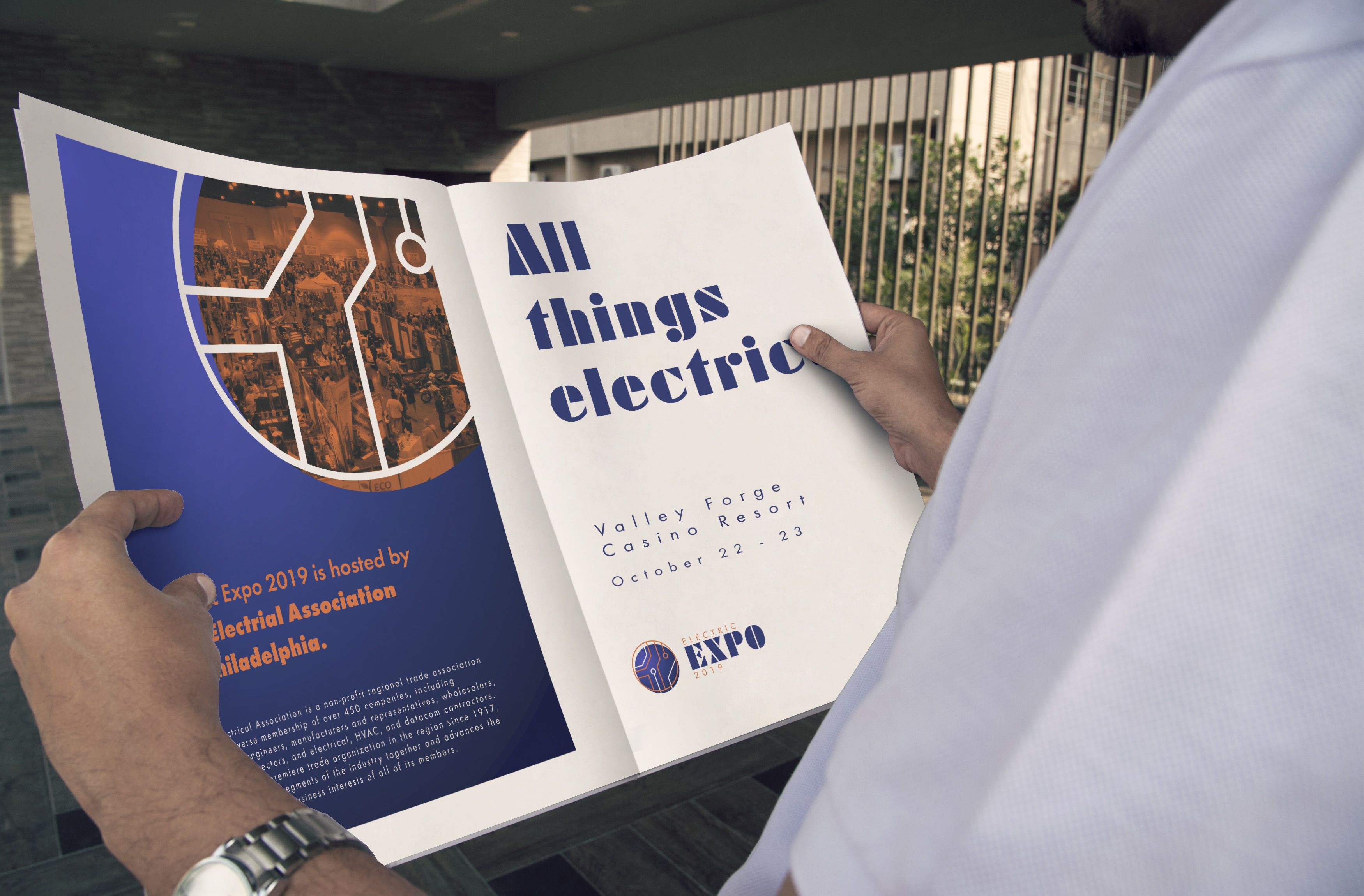
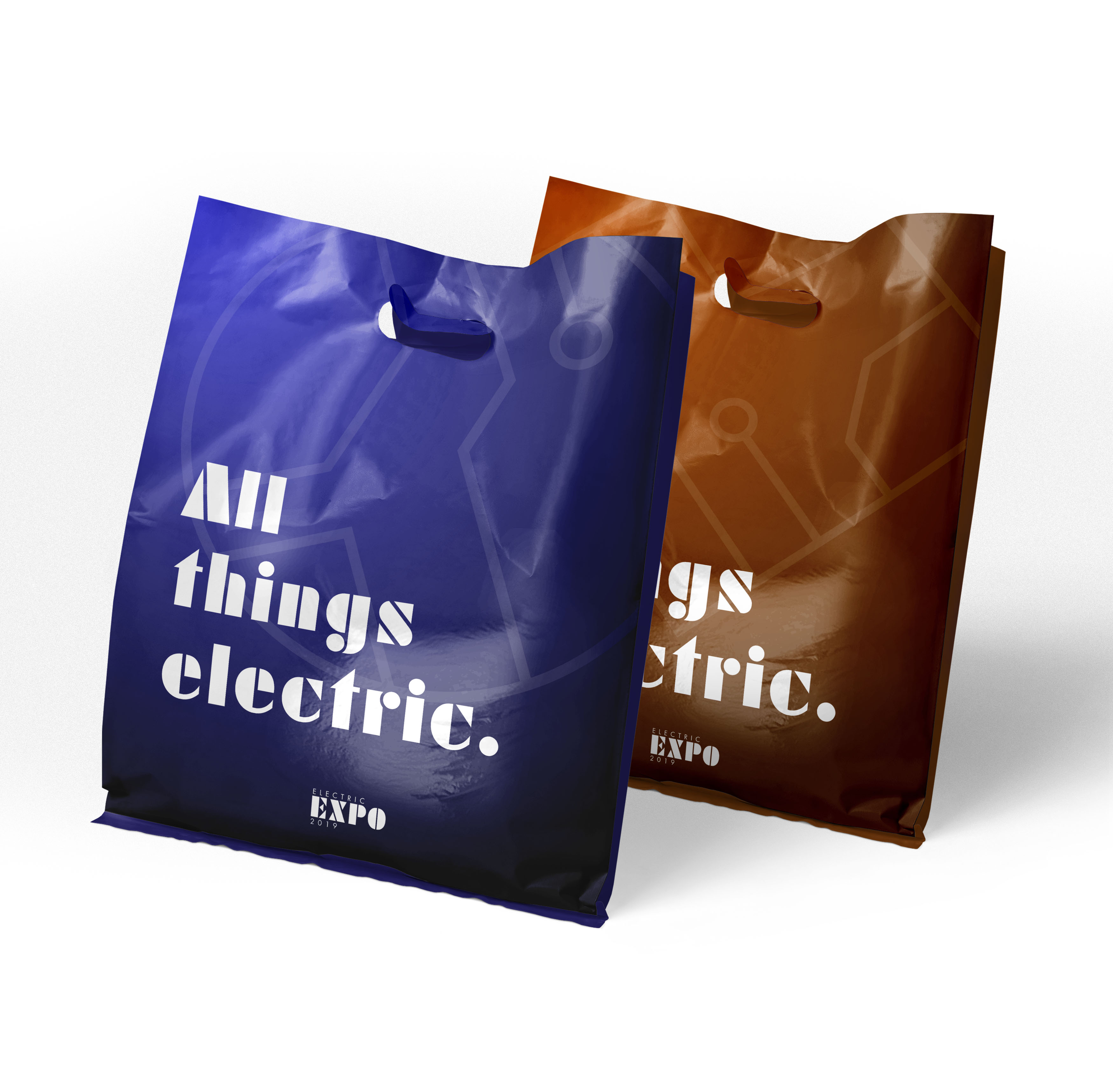
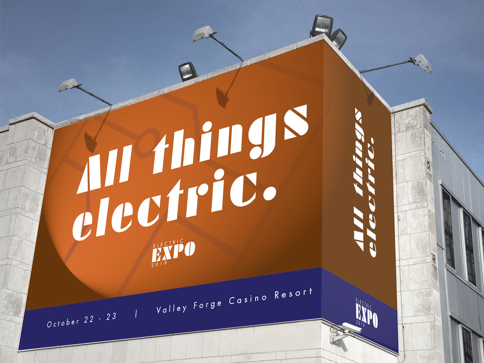
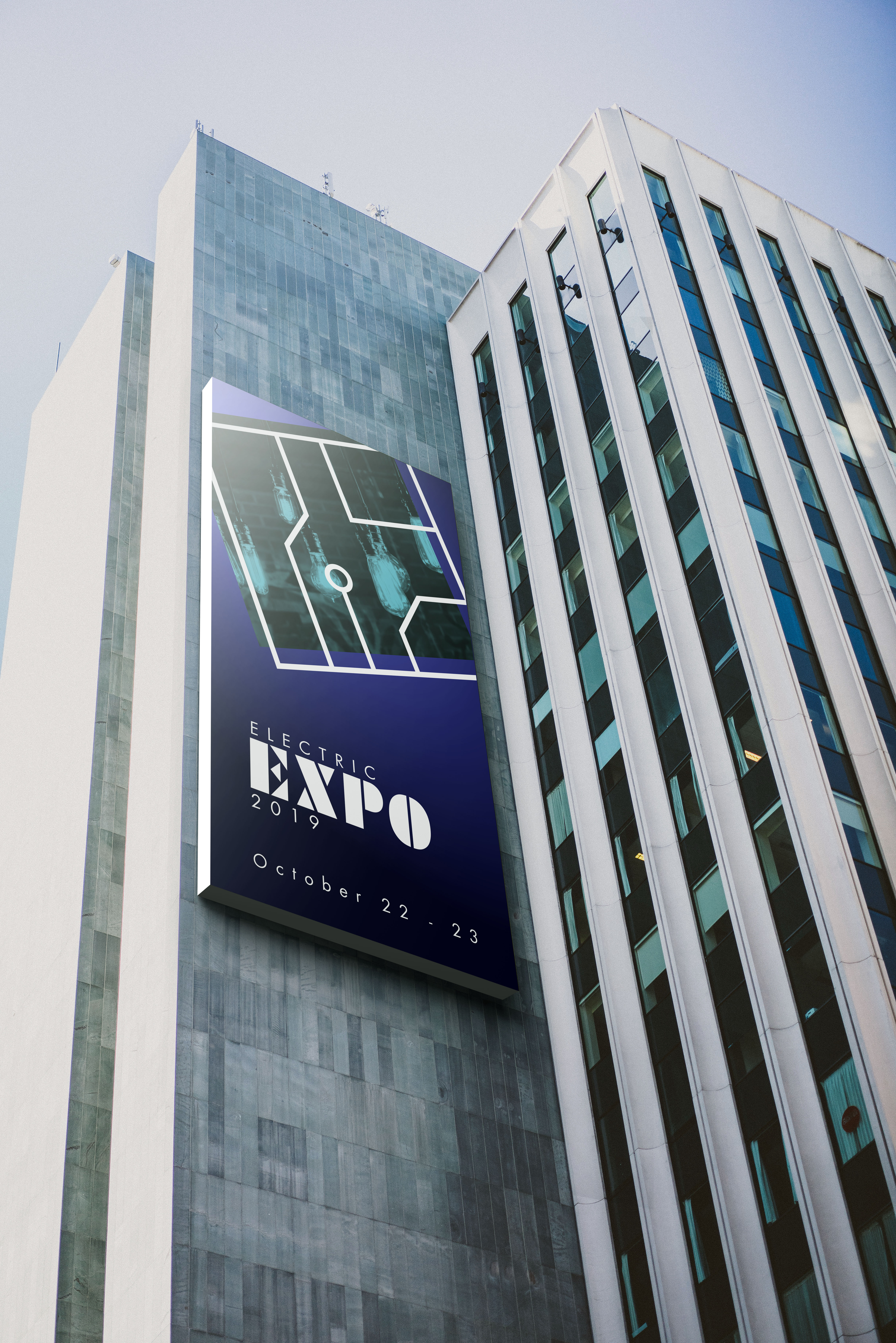
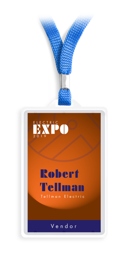
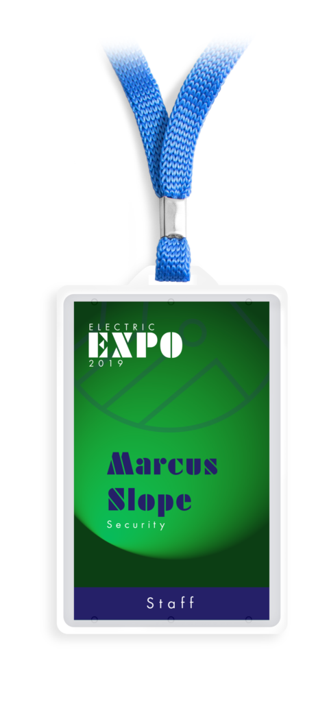
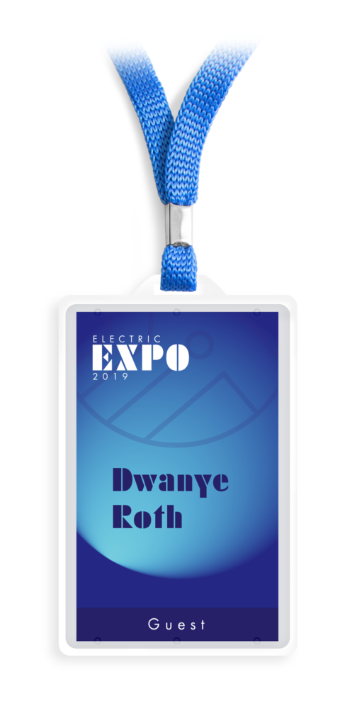
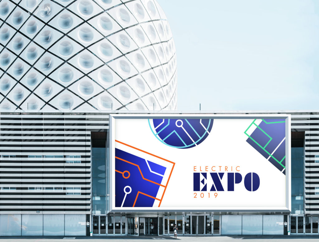
Every year, over 3,000 attendees will gather in Philadelphia to look at vendors that represent all things electric. For the 2019 Expo, a logo was needed that captured the essence of the event. The final logo was expanded into an identity that included designs for signage, badges, and printed collateral.
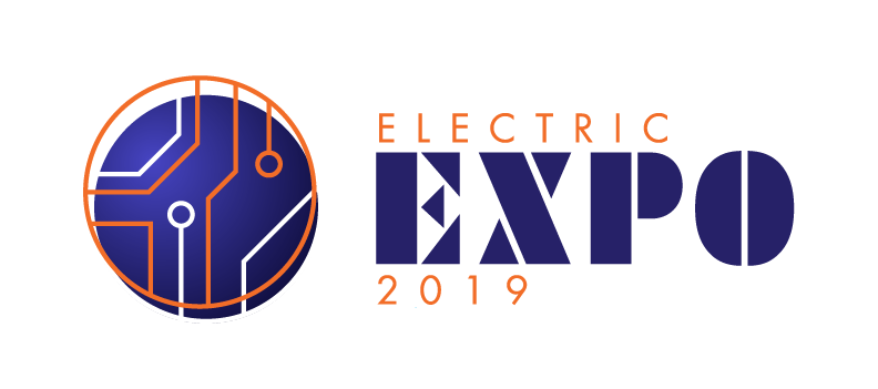
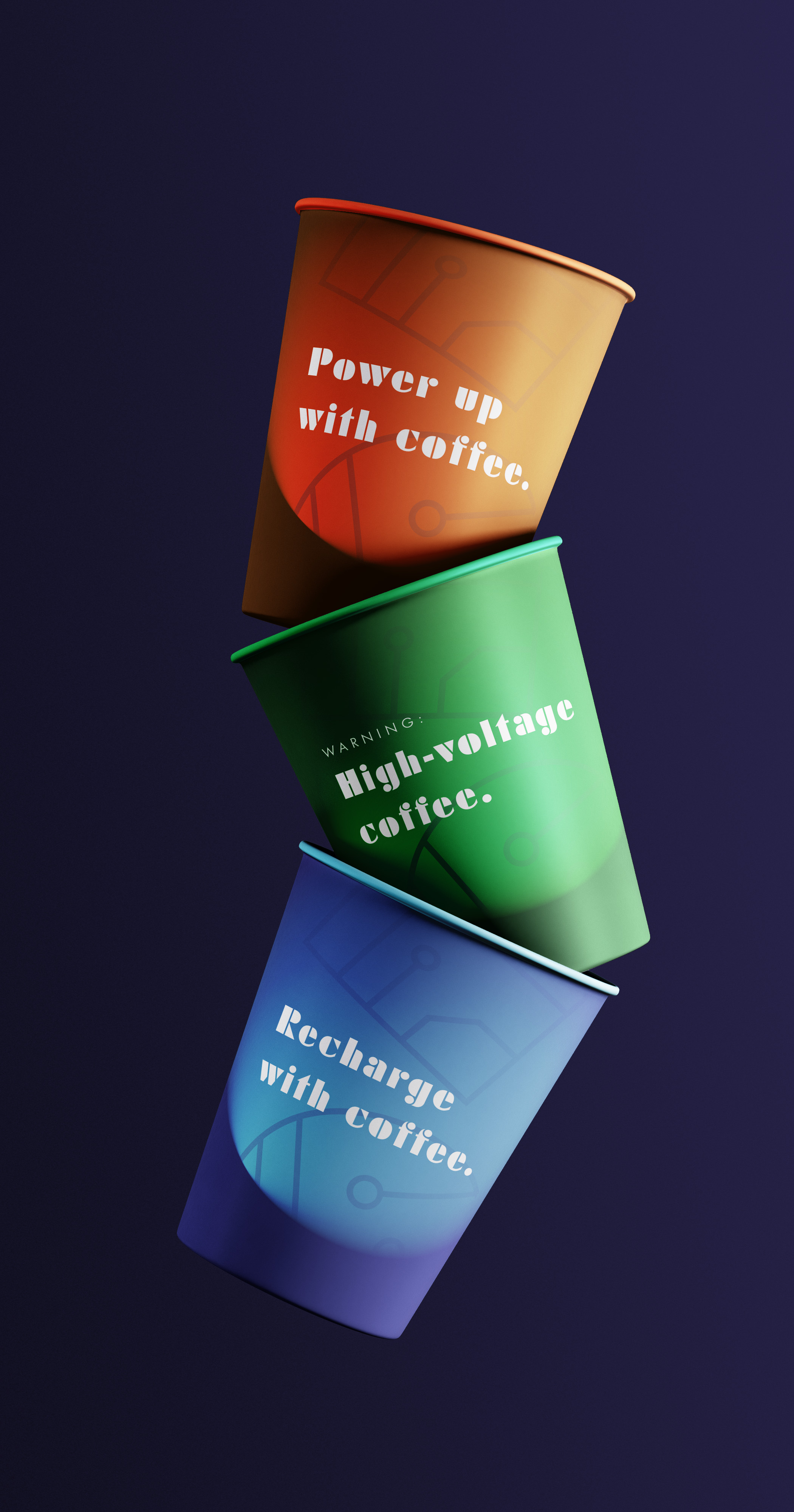
The circuit motif became an evolving visual element that could be used in a variety of places. The dark blue gradient became the primary background for the circuit board, and the three identity colors were interchangeable for the top layer of circuits.
INITIAL CONCEPT
Logo Process
The journey to any logo is long and full of revisions. The initial desire for this logo was to capture the essence of the expo and to symbolize electricity, which is a daunting task. Through four rounds of revision, the logo evolved as a representation of electricity while remaining visually interesting.
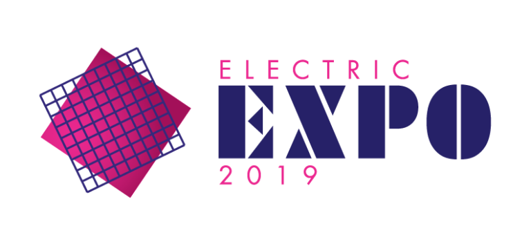
The original concept was an abstract approach of depicting an electric grid. The square in the background had a subtle gradient, which would turn into a bolder motif in later rounds. The grid that laid on top was simple in nature as a captivating visual element.
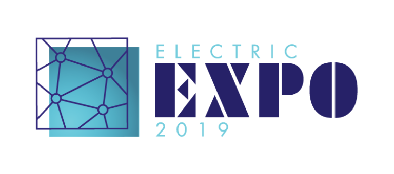
SECOND ROUND
In response to client feedback, the top grid was redesigned to emulate the network of an electric grid, with all the nodes being connected. The typography was very well received, so it remained constant throughout all the rounds.
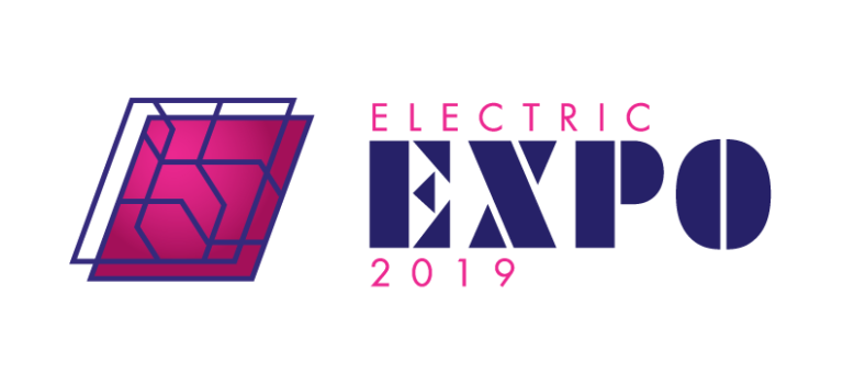
THIRD ROUND
The client loved how electric grids looked, with layers of wireframes stacked on top of each other. A true recreation of an electric grid wouldn’t work for a logo, since it’s too complex to be functional. But the design was reworked as a more abstract representation of a grid system.

FOURTH ROUND
Nearing the end, all that remained was pushing the layers a little further, adding some more identifiable circuit elements. The fourth round of designs was approved, and the last thing to do was to solidify the color scheme. The dark blue with a gradient became the primary background color, and a bold orange, green, and blue became the accent colors.
An additional design element was developed based off the original usage of gradients. Using the three accent colors, gradients were manipulated to look like a spotlight was shining on a smooth surface. This became a primary background for supporting collateral such as signage, badges, and merchandise.
