THE CHALLENGE
Talented artist, teacher, and fiber arts expert Amie Palmer crafts unique yet versatile patterns for developing knitters and sewers. When her original work started gaining recognition, it was time to elevate her brand to the level of her craft.
Like many small businesses with DIY designs, Amie began taking notice of her competitor’s sleek, modern brand identities. And somehow, these brands felt out of reach. Amie’s skills and services wowed customers, but her growth remained stagnant because her brand never grew with her.
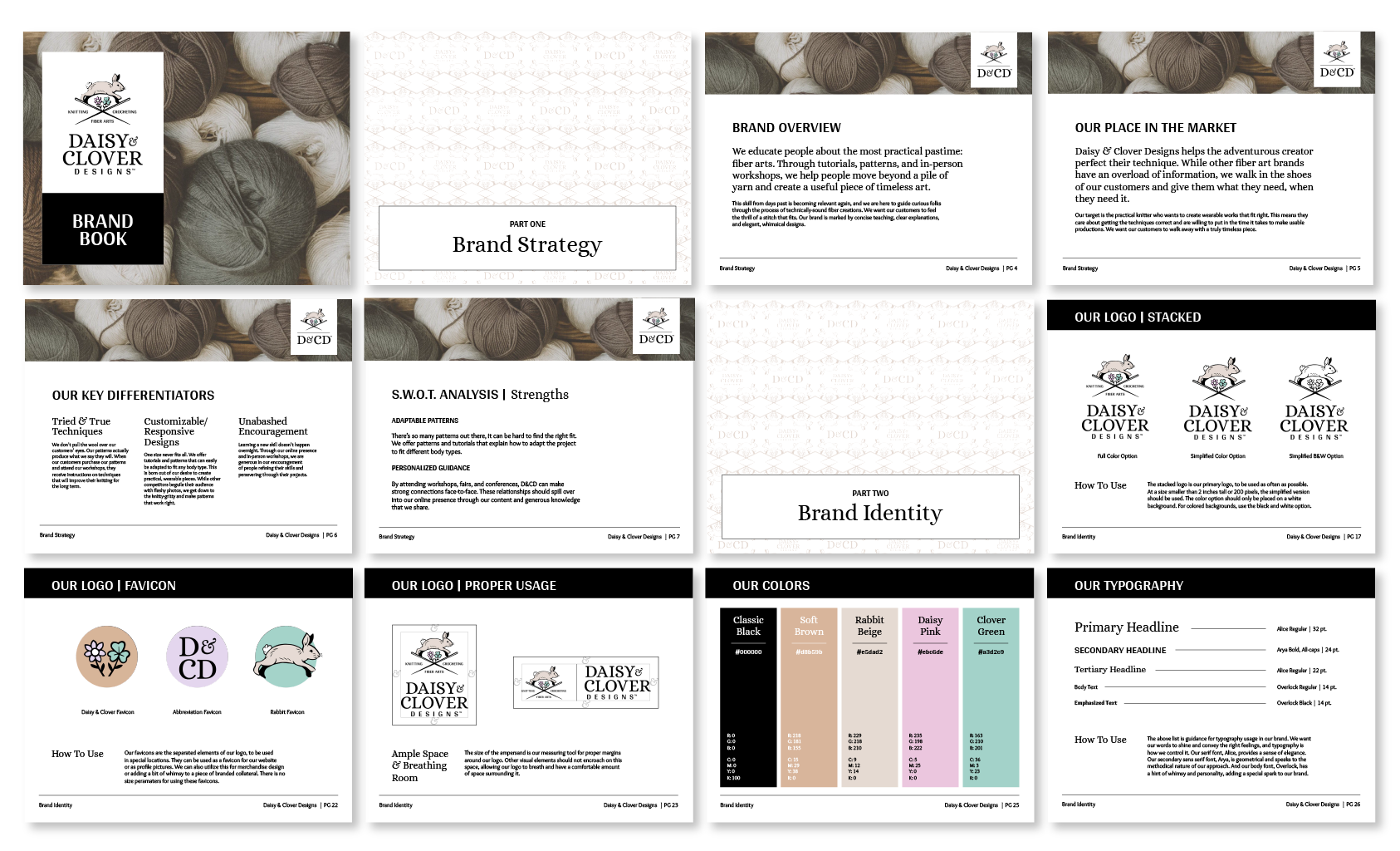
Flashy visuals with no strategy behind them are just pretty to look at. Before reimagining D&CD’s brand identity and all the exciting visuals that come with it, we laid the groundwork by defining D&CD’s position in the market, who its audience was, and what its key differentiators were. Then, we built visuals that communicate these elements and attract the right customers.
OLD LOGO
THE SOLUTION
First, we began with a brand strategy session to understand where Daisy & Clover D&CD fit into the fiber arts market and where the biggest potential lay. Then, we got our hands dirty designing an original identity based on D&CD’s values.
Through the creation of the strategy roadmap, we pinpointed D&CD as a brand that favors elegance and personalization over genericism and craftiness. We then worked on better defining the value and benefit of D&CD’s offerings.
D&CD’s original logo concept was functional, but presented usability issues and failed to visually convey the sense of elegance and whimsy associated with D&CD’s brand. Keeping its core elements intact, we redesigned the logo with a fresh, timeless appeal.
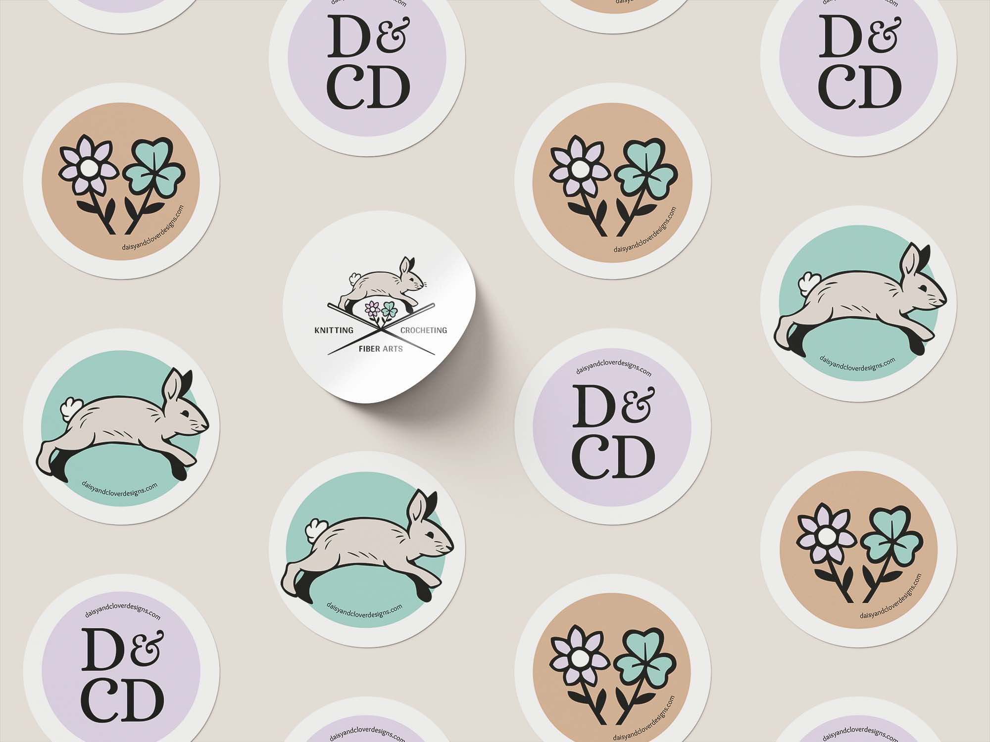
The new concept portrays a rabbit leaping between needles with a daisy and clover prominently positioned in the center of the logo. We carefully selected new typography that exudes elegance and timelessness, just like D&CD’s designs. More importantly, we created a responsive logo design with high usability that can be formatted and presented in various ways.
NEW LOGO
HORIZONTAL
MONOGRAM
