Every business needs a logo, and that’s something even the most novice business owner knows. But if you want to take your business to the next stage of growth, you need more than a logo. Having a visual identity system allows all your brand visuals to be coherent. Brand visuals are one key component to establishing brand recognition, the other being your brand voice.
Brand Visuals And Brand Voice
Brand visuals is everything a company puts out that people can see. From packaging to commercials to email blasts, you can achieve consistency through visuals and designs. A brand voice is all the words a company uses. This encompasses everything from the captions on Instagram posts to instruction manuals to radio spots.
Both of these have to resonate with your target demographic, or your ideal customers. For example, if you’re running a daycare center, you’ll be marketing towards young mothers and families. But what if all the photos on your Instagram are dimly lit, grainy snapshots, and your website is full of dull, muted colors? And what if all the words on your socials use texting shorthand and there’s grammar mistakes everywhere? When your ideal customers come across your website or social pages, they’re not going to feel like your daycare is warm, welcoming, and trustworthy, which is essential for a daycare. They’ll move on to your competitors in search of a company that aligns with what they need.
This is why it’s important for any business to pay attention to their brand visuals and brand voice. Consumers make purchasing decisions based on what they see and hear, so you want your brand visuals and voice to bring them into your marketing funnel, not drive them away to your competitors.
So, if you want to establish brand recognition, you have to have consistency in your brand visuals and brand voice. Your brand voice is an area where a copywriter brings their expertise, and brand visuals is where a designer steps in. This article is going to focus on brand visuals and a visual identity.
What Goes Into A Visual Identity
A visual identity is an expansion of your company’s logo, and is a system that allows your company to put out visual components that create visual brand recognition. There are a few staples of an identity system that will help guide all other visuals produced.
Logo Options
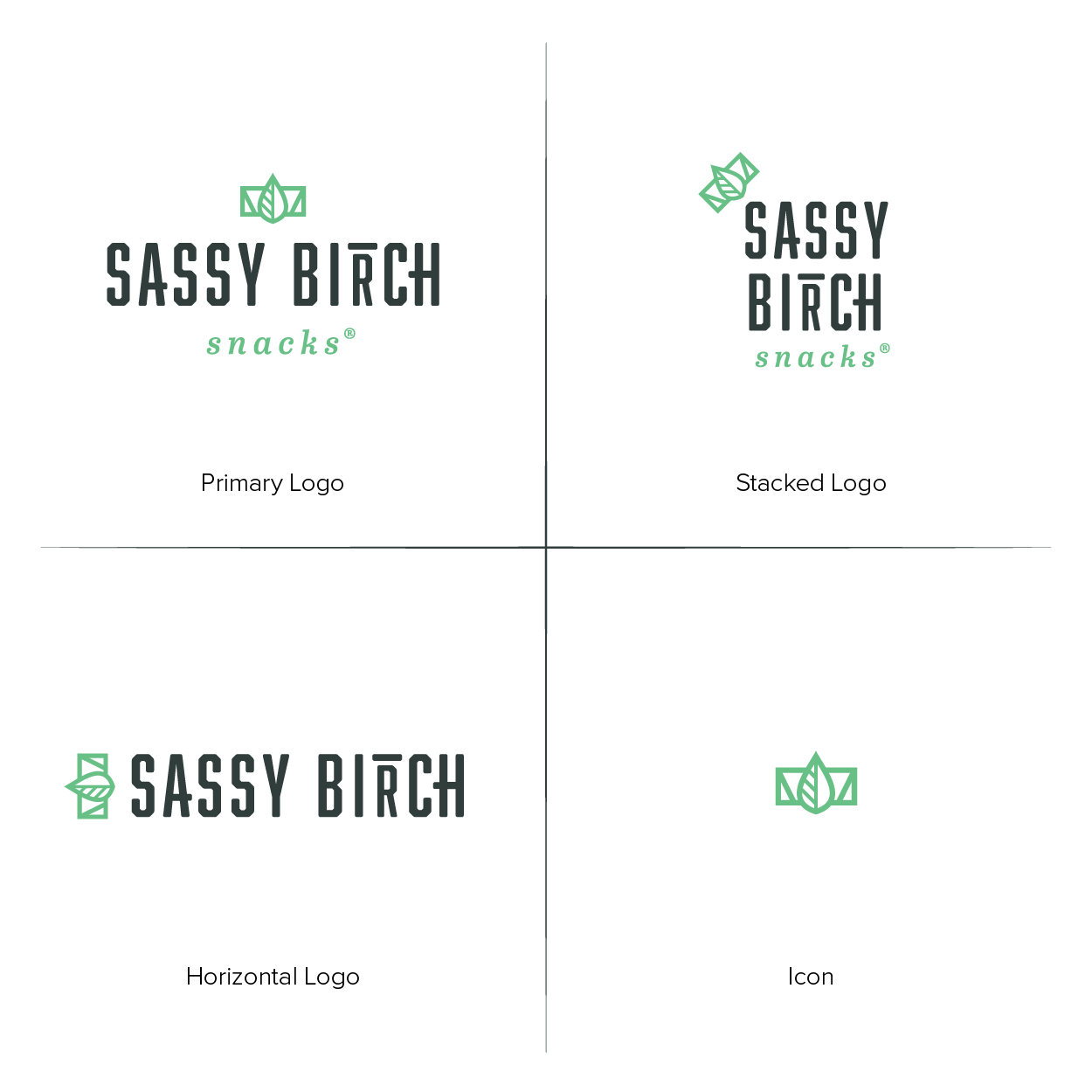
Almost every effective logo has some layout options. This is not different logos for the same company because you couldn’t settle on one! It’s one identifiable logo with alternative layouts. So, if your primary logo is longer horizontally, you might have a stacked option to use in locations where the primary one would be too squished. Or you might have an icon/monogram option to be used in very small locations, such as uniform patches or app icons. All the options should clearly belong to the same company, but by having a selection to choose from, you ensure that your logo is adaptable to where it’s being utilized.

Every company should have a primary logo and an icon/monogram. Depending on the design or the usages, you might also require horizontal/vertical options or a monotone option.
Color Palette
Color is one of the first things that will affect how a consumer feels about your company. It’s also one of the most powerful ways to establish brand recognition. We can recognize popular brands through color combinations alone! Having a brand color palette will instantly provide consistency in your company’s visuals.
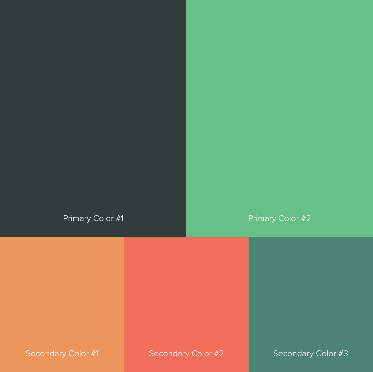
Based off the logo, you should have no more than three primary colors. Your logo needs to be able to function using only one color, and should work solely using a primary color. These colors will be the first attempt to portray your brand’s emotions.
For example, if you run a fitness gym, effective primary colors could be bright red, orange, or a bold blue. Couple those colors with black and you immediately evoke high-energy and intensity, which work great for a gym. If you run a spa, you’ll probably avoid punchy colors in exchange for soft pastels or natural greens and blues. That speaks better to people who want to relax and get away from the stress of life.

In addition to primary colors, you can also have secondary colors. These are the colors that aren’t used as often, but still fit within the emotions of the brand and serve to identify the company. Secondary colors are often very effective for products that have multiple flavors/options or a company with subbrands or alternative services. Another way of thinking about secondary colors is to think of them as accent colors. They don’t steal the spotlight from the primary colors, but rather are used on occasion to highlight special information or unique callouts.
As with primary colors, you don’t want the whole rainbow in your brand’s color palette. Secondary colors should be limited to 3-5 options. The more colors you have as your “brand colors,” the less effective they are at creating brand recognition.
Typefaces
The final thing you’ll want determined for your company’s identity system is the fonts, (or typefaces. A typeface is one specific weight of a font, i.e. Avenir Medium. A font, or font family, would be all the weights of Avenir. For an identity system, it’s important to specify typefaces from font families, because some font families could have 12+ weights, and narrowing down which ones to use helps maintain consistency.) Fonts also impact consumers emotions, because different fonts can subtly tell us different things. There’s fonts that say “luxury,” there’s fonts that say “playful.” Many people ignore selecting fonts for their brand because they don’t realize how big of a role they play in consumer’s perceptions.
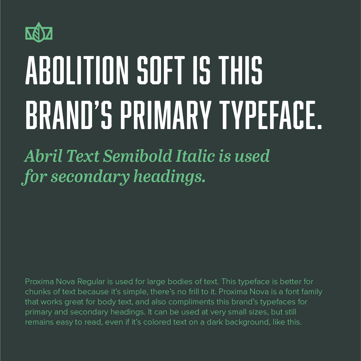
Every company should have at least three typefaces to be used in specified areas. Primary headings, secondary headings, and body text. This is where your designer will lend their expertise in selecting the typefaces for different usages, but I’ll provide an overview so you can be aware of what you need.
The primary heading is used for the most important information. So, on a website, if you have a large slogan on your opening page, it should be in the typeface used for primary headings. On a brochure, the main callouts could be in your primary heading typeface. Primary headings usually aren’t lengthy in words, so if you have five or more lines of text, it’ll most likely be better suited for the typeface of your secondary heading or body text. Typically, primary headings use the typeface that is used in the logo.
The secondary heading typeface is used for information that is read right after the primary heading. This shouldn’t overpower the primary heading in size or noticeability. Secondary headings are great for bullet points or lists. Since there could be longer lengths of text, this typeface should have better legibility when used at smaller sizes or in larger chunks of text.
The body text typeface is for all the paragraphs that are used. Since bodies of text are usually smaller, the typeface needs to have good legibility when at a small size. It doesn’t have to be flashy or showy, like the primary heading could be, but rather completely functional in it’s usage.

Having brand typefaces will help maintain brand recognition and consistency. It also can be the mark of an established, professional company, because consumers respond well to coherent brand visuals. That’s the entire point of having a visual identity system, instead of just having a logo that you plaster everywhere.
Make sure you have some guidance!
When hiring a designer to develop your identity system, you must make sure at the end of the project you’ll receive a brand guidebook. This is the glue that holds an identity system together. Essentially, it’s one document where your logos, colors, typefaces, and more is compiled. It explains how and where these visual elements should be used, so no matter who is creating your brand visuals, the consistency remains.
If you find yourself needing a logo and identity system, don’t hesitate to get in touch today! For more on logos, identities, and brands, check out these articles.

