A logo is your company’s first step in growth.
Somewhere near the top of your list for starting a business, you’ve written ‘get a logo.’ Every business quickly reaches this step when beginning, and it’s usually the thing that makes it feel like a real business. But as the business grows, many owners never revisit that list. As the business gains traction, every business owner should go back to that list, scratch out that entry, and next to it write ‘get a GOOD logo.’ 9 times out of 10, the logo a company gets at their start is not a good logo. (To really dive into what makes a logo good, check out this article.) As a quick overview, a good logo is simple, memorable, and relevant to your desired brand position. It’s not easy to make such a logo, nor is every designer skilled enough to do so. And the designers that ARE experienced and skilled enough to deliver an effective logo are typically out of the budget range that new companies have. So new business owners either go with the cheapest route and create their own logo, or spend a few bucks on sites that pump out cheap, generic, and often-ripped-off logos. With a large amount of certainty, you can bet that new and growing businesses will have less-than-great logos. And that’s why as your business grows, you should circle back to your to-do list and update it.
But why is having a bad logo a problem? Why should a business invest money into getting a good logo? We’re going to dive into the 3 main ways that having a bad logo is harmful for any company.
1. A bad logo makes a business look small and unprofessional.
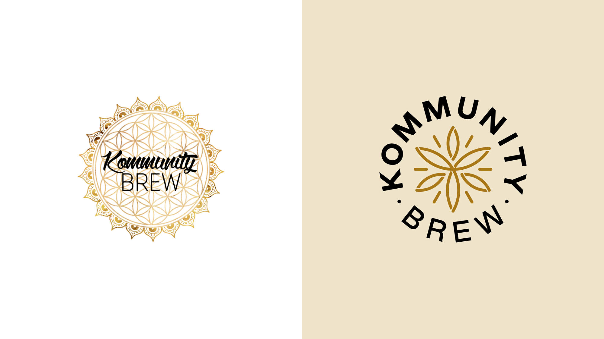
Although the average person doesn’t know the ins-and-outs of design, they have an instinctual understanding of good and bad logos. This is because the big, ‘namebrand’ companies have good logo designs. Consumers have associated the qualities of those logos, (simple, easy to remember, reflective of desired brand,) with being professional and established. A good example of this is Kommunity Brew, a kombucha drink company. Their original logo was complex and far too detailed. The brush font and gold gradient made it feel generic, and there wasn’t anything distinctive enough to easily be remembered.
OLD vs. NEW
They underwent a rebrand, and their new logo hits the marks of being effective. It’s simple, without excess, which makes it usable at any size and easy to replicate. It’s unique enough that it will dwell in the minds of consumers and help establish brand recognition. And its style is still ornate and interesting, which is relevant to their brand. Kommunity Brew’s original logo made them appear like a small startup. This can be damaging to a company, because consumers always go with the safest option. A small business poses more risk. If you had the option between a drink product from a large company and a drink product from a small company, the large company has less risk. They’re more likely to have better quality ingredients, better regulations and quality control, more research and development, and more consumer feedback that would result in a better product. When we think of a small company, we think of one person doing multiple jobs, less oversight or accountability, perhaps even some corners cut to make ends meet. When given the option between a small company and a large company, the large company will win out because the consumer will consider the large company as less risky.Consumers always go with the safest option, and bad logos make a company look small and risky.Having a bad logo increases the chance that consumers will view your company as risky. It will put you in a different league than the bigger, more established businesses. If you find yourself struggling to level up your business, chances are it’s because to your consumer, you still look like a startup.
