In last week’s post, we covered the basic definitions of branding, visual identity, and logo, and took a closer look at branding through athletic powerhouse, Nike. Let’s now move into the next word, and truly understand what a visual identity is and how your branding should affect it.
We learned from Nike that branding is an intangible entity; it’s the feelings and promise that consumers associate with a company. A visual identity, however, is the very tangible counterpart. A company’s visual identity is how consumers differentiate one product or service from another. It’s common to assume this responsibility solely lies on the logo. While the logo is the primary visual component of an identity, it’s by no means the only one. The logo will dictate all the other graphics used throughout the company, but shouldn’t be the only visual element created for a business.
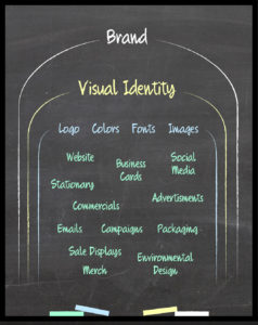
Take a look at this diagram. The brand is over the entire company, and everything the company produces should point back to the brand. The visual identity is comprised of a logo, color scheme, fonts, and images. These are predetermined visual attributes that are then implemented into everything the company releases into the world.

You can see from the diagram that if a company is handled well, all of its tangible assets should fall under the visual identity. A great example of this is Coca-Cola. It’s primary competitor is Pepsi, but Coke is decisively winning the battle. “In 2011, Coke brand held 17 percent of the US soda market, followed by Diet Coke at 9.6 percent and Pepsi at 9.2 percent, according to Beverage Digest.” Despite the ongoing argument, the truth is the taste between the two isn’t worlds apart. In fact, they’re chemically nearly similar, and in most blind tests, people choose Pepsi over Coke.
So why is Coke the kingpin of the soda world? It starts with branding. Though people argue about taste preferences, almost no one denies that Coke has a superior brand position. That means they’ve established themselves as the better product. And they’ve gotten there in part because of their visual identity.

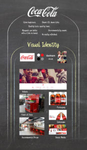
As you can see from this diagram, Coke’s brand can be boiled down to a few feelings and promises. They have really focused on tying human emotion to a soft drink. Capturing life’s moments is a very important stance for them, and it ties back to the history of Coke. Check out Coca-Cola’s own article outlining their history to get a great overview, but in a nutshell, their brand position began to take form in the 1970s, “when Coca‑Cola’s advertising started to reflect a brand connected with fun, friends and good times.” Coke might be one of the best companies at tapping into the phenomenon of nostalgia in their visual identity. The classic red and white logo is at the forefront, the fonts they use are timeless, and the images implemented into ads, campaigns, and their online presence often have a Polaroid-type filter.
Furthermore, they are consistent with their identity. Perusing through their social media, commercials, packaging, campaigns, etc., gives you a great concept of how integrated their visual identity is within the company. Coke can even now be recognized on the red and white colors alone.

But you’re probably not in the position to forego all visual elements except for two colors. That takes years and billions of marketing dollars. So what is the role of a visual identity for a small business? It’s the tangible elements that reinforce your company’s brand. Once you’ve shared your brand with your designer, they should respond with a logo, color choices, fonts, and images that reflect your brand.
This step is where gut-instinct is key. When you look at the work your designer delivers, does it bring the feelings and promises you want your company to convey? Grab some friends and family and ask them the same question. If you’re really prepared, find some people who fit your target demographic and see how they emotionally respond to the delivered graphics.
If you’re running a daycare, but your designer chose droll, monochromatic colors, you’re not going to feel happy, warm, or safe. If you run a gym targeting bodybuilders, but your designer opted to use a crazy font with curly cues, you’re not going to attract your ideal customers. Pinpointing your brand is vital to nailing the visual identity, otherwise you might end up scattered and misguided.
Now you might’ve started simply by wanting a logo, but hopefully you now have a better understanding of the role graphics play in your company. But your logo is still the primary graphic, and there are certain things to look for and pitfalls to avoid when hiring a designer and choosing a logo. We’ll tackle that monster in part 3, so please like, comment, share, and return next week!

