Logos: The Breakdown
If you haven’t read the first two posts of this series, check out the one about branding and the one about visual identity. Now that we’ve covered those two ideas, it’s time to truly understand what a logo is and what makes a good one.
As briefly covered in previous posts, a logo is the primary graphic of a company’s visual identity. All the other graphic elements are built around the logo, so if a visual identity was a house, the logo would be the foundation it’s built on. After brand exploration, i.e. identifying what the company plans on promising to their customers, the logo is the next item to develop.
The Purpose of a Logo
While a logo’s definition is simple, understanding what makes a logo work or not is something designers spend years on. A good logo can be broken down into two parts.
-
Usability
-
Perception
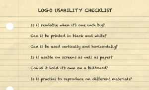
When looking over the work your designer presents to you, the first thing to check for is the usability. Quite simply it’s how practical your logo is. Take a look at any company and you’ll see how integrated the logo is. It’s used on nearly everything, from packaging to letterheads to websites and more. Your logo needs to work across a variety of platforms. Here’s a quick checklist to see if a logo has usability:

This is a good general checklist, but based on your company, you might have more specific needs. For example, if you’re going to offer an app connected to your company, how can your logo be adapted into an app icon? If it’s an object that will be in tubular packages, will it still be readable wrapped around it, or can it work in a long, horizontal format? Logos are never a “one-size fits all,” so be thorough in your pursuit for a perfect match.
[clickToTweet tweet=”Logos are never a ‘one-size fits all,’ so be thorough in your pursuit for a perfect match. ” quote=”Logos are never a ‘one-size fits all,’ so be thorough in your pursuit for a perfect match. “]
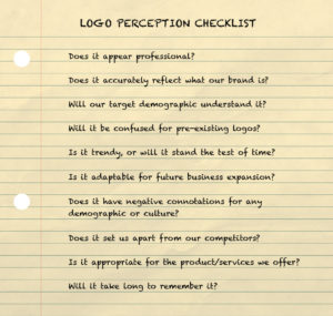
Secondly, a logo should be perceived well. In other words, what will the world think about it? Run your logo through this checklist to see if it can pass the perception test.

As we’ve established, the logo is the primary graphic for your company, so if it is weak in the perception stage, then it could very possibly harm your overall brand image. A common difficulty is in that second questions. Does it accurately reflect what you do or what you offer? Some business owners get stuck on what that means. Does your logo for a mechanic shop HAVE to include a car? How do you visually describe a consulting service? The answer lies in the company’s brand. A logo’s job is to communicate the essence of your company to your desired audience. This can be done with a literal or abstract reflection.
Logo Case Study
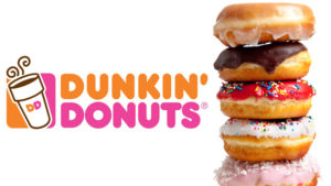
Let’s understand this spectrum by comparing two competitors with famous logos: Dunkin’ Donuts and Starbucks. Dunkin’ Donuts has the literal logo with a clearly rendered steaming cup of joe. The orange and pink colors are warm, inviting, and evokes the image of brightly frosted donuts. It used to include a donut character and then a image of a donut being dipped into a cup of coffee. But even through it’s development, it’s no stretch to imagine what they offer.

Then there’s the caffeinated king, Starbucks. By now, after decades and millions of marketing dollars, nearly everyone recognizes the green circular logo. But why does it pass the test? It has absolutely nothing to do with coffee. Starbucks has taken the more “abstract” approach and stands apart from its competitors because of it. Now the mermaid isn’t an image pulled from thin air, the famous logo is actually rooted in the company’s history. And it’s a visual that subtly supports Starbucks overall brand identity. This article details the history of the logo and nicely sums up why the logo passes the perception test.
“The mermaid is a universal symbol and one that is tied to ancient fables, mythology, and stories. Starbucks is a place where people can feel free to tell their stories, be themselves, and share ideas with friends.”
Starbucks went with a logo direction that reflects their brand more than their product.

Conclusion
Now one approach isn’t better than the other, it comes down to what will work best for your business. A great designer will spend time learning all the aspects of your company and brand so they can best determine which approach is ideal for you. The best logo will reflect your brand and allow you to develop a memorable visual identity. When those three elements work together, you become a company ready to successfully stand apart from the crowd.

