CRAIG STREET MEDIA
Identity Design
When offering marketing services, it’s important that a marketing agency itself has a strong identity. Craig Street Media is a new agency on the scene, and they were looking for a logo and identity that communicated warmth and friendliness, while being easily recognizable. Owner Ryan Caravalho had a distinct vision behind his company. In his brief, he explained the inspiration that drove him to start Craig Street Media.
“Craig Street is the name of the street I grew up on with my grandparents, in a small town in Massachusetts. Many amazing stories were told, created, and lived there and I want to bring that feeling of wonder to the work we produce.”
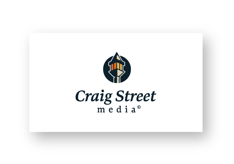
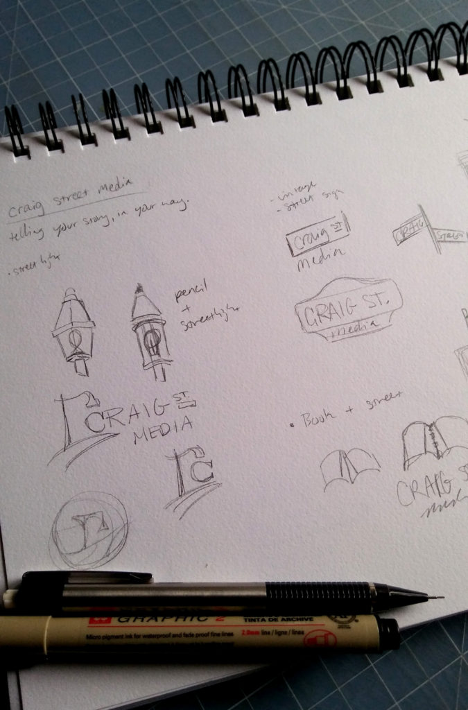
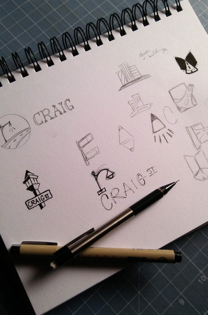
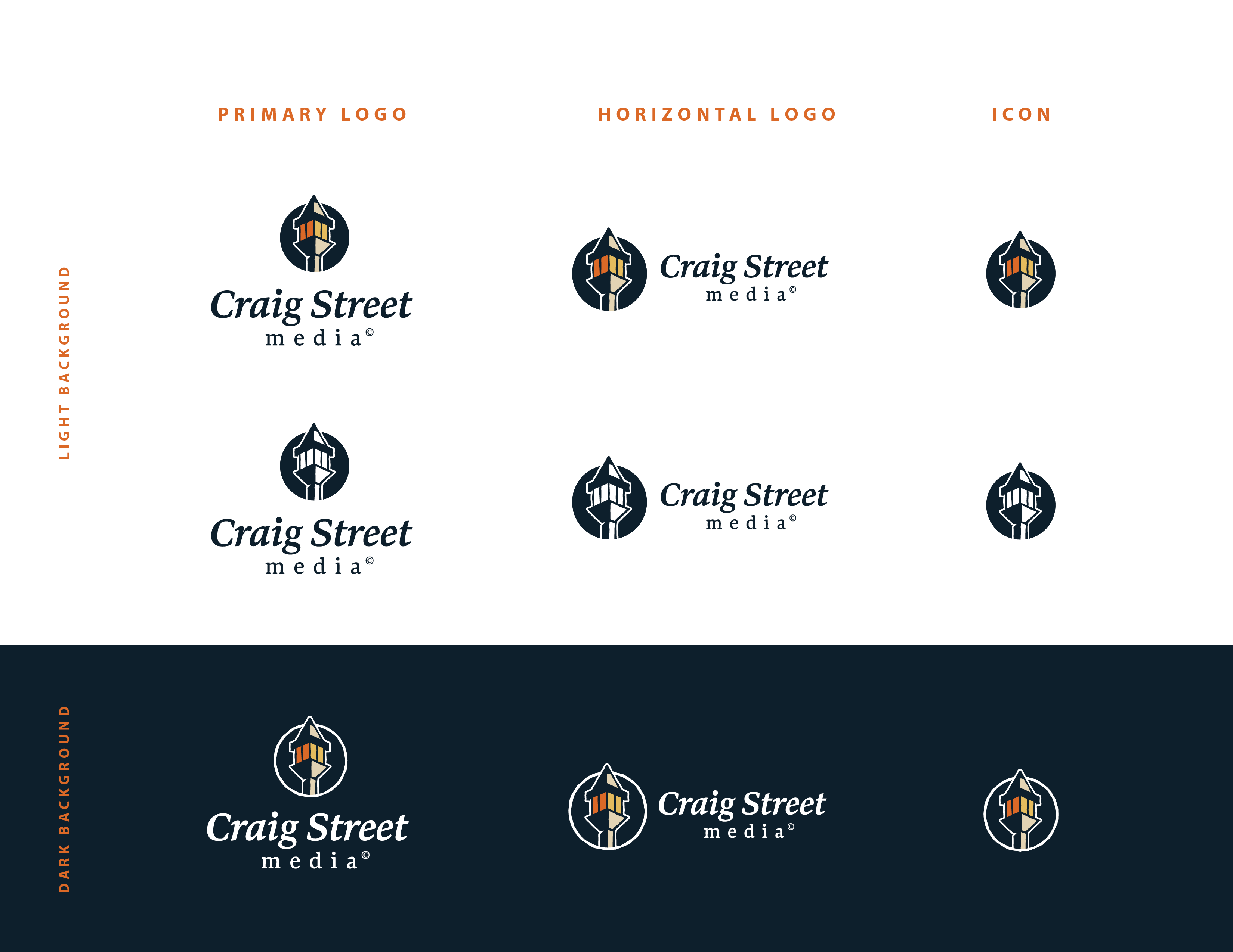
In exploring concepts for the logo design, one idea rose to the top. Having a lamp post as an icon resonated with the feelings of nostalgia and a small-town community. Since Craig Street Media focuses on creative story telling, it was also important to include a visual nod to writing within the logo, which resulted in combining a lamp post and a pencil.
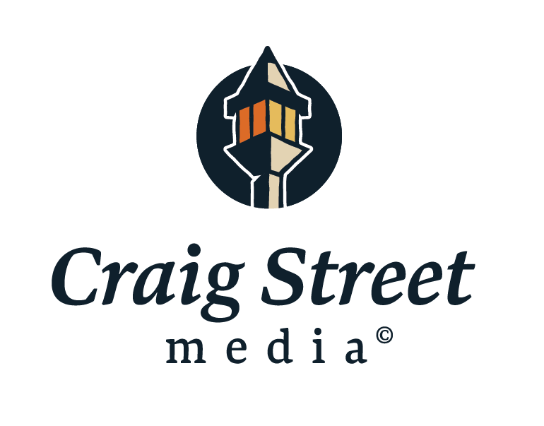
PRIMARY LOGO

HORIZONTAL LOGO
ICON
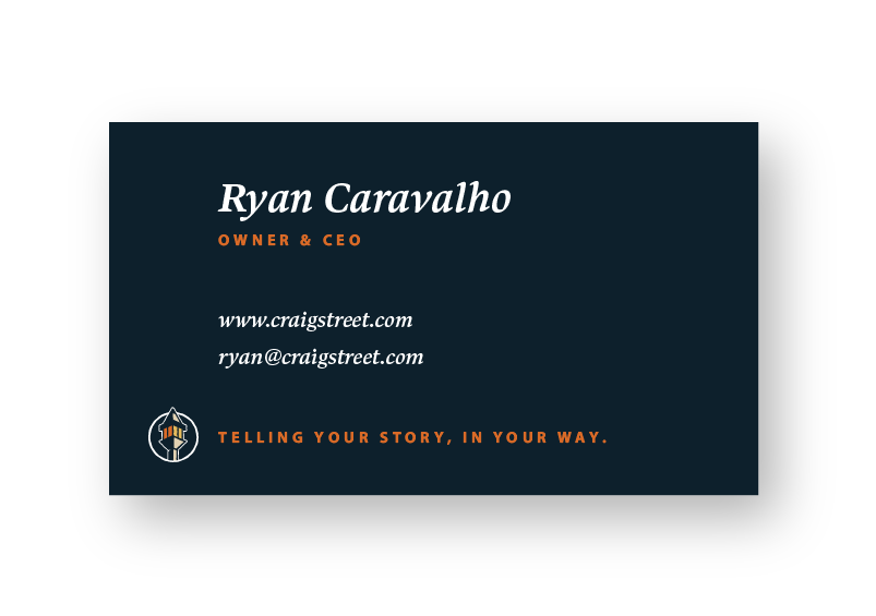
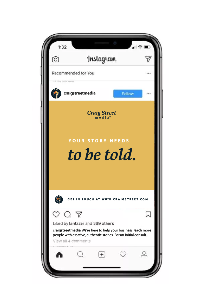
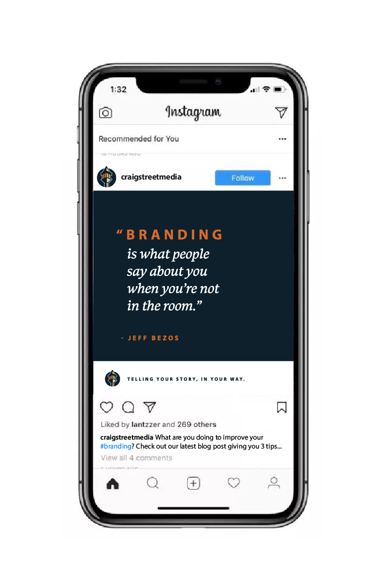
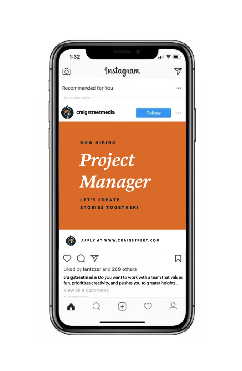
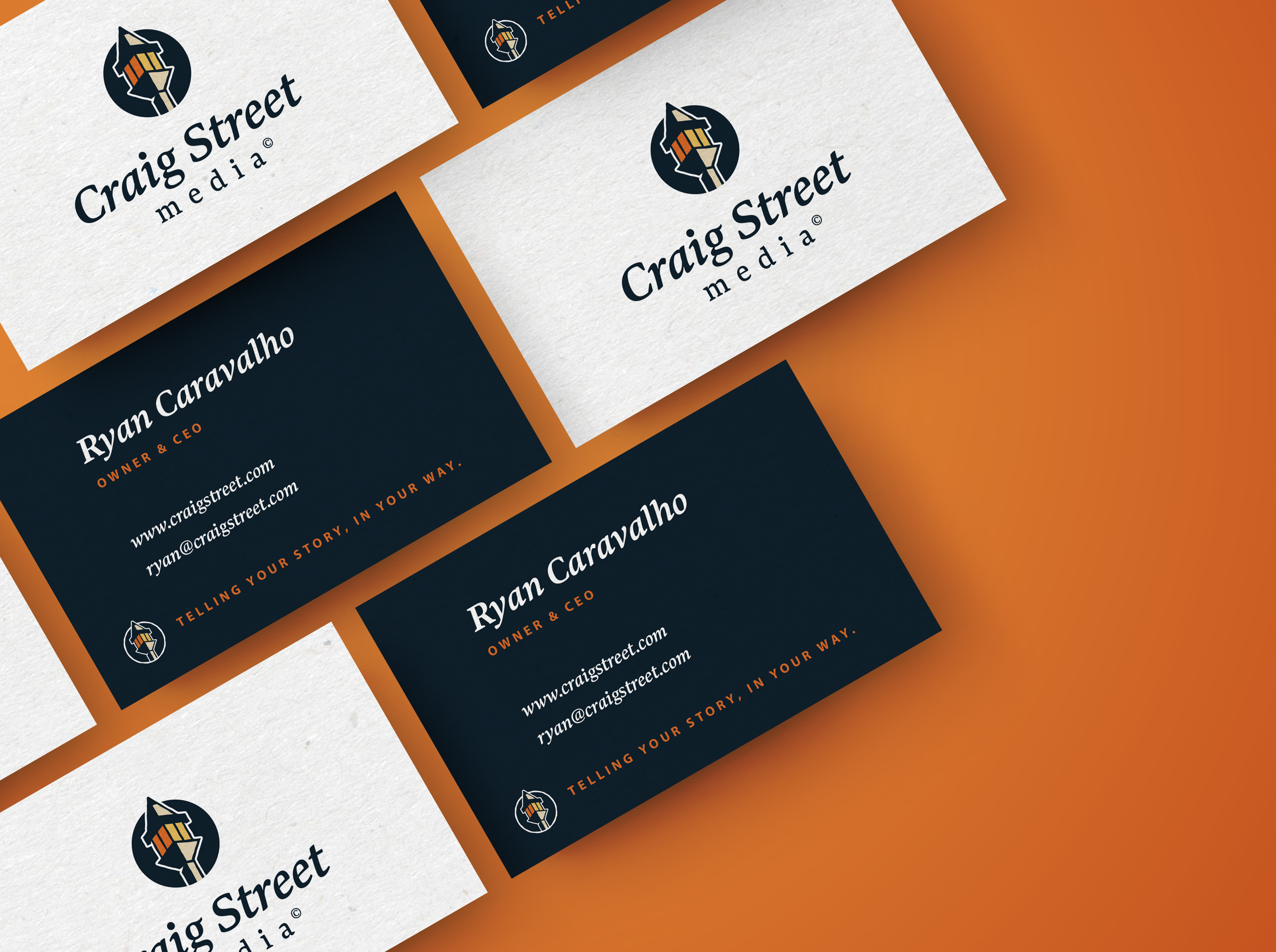
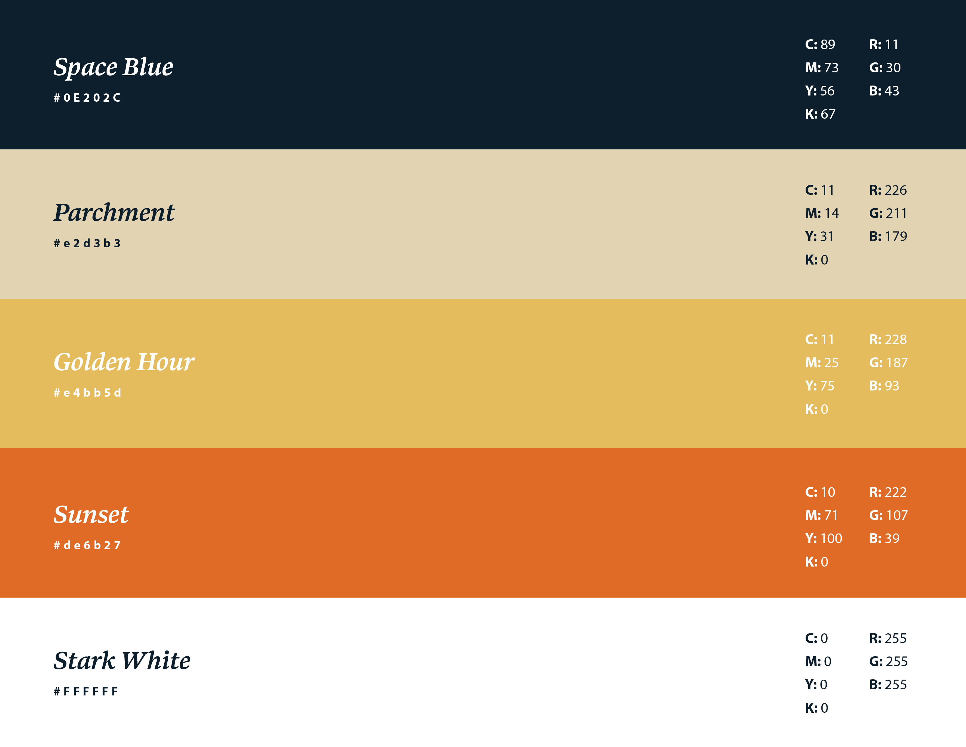
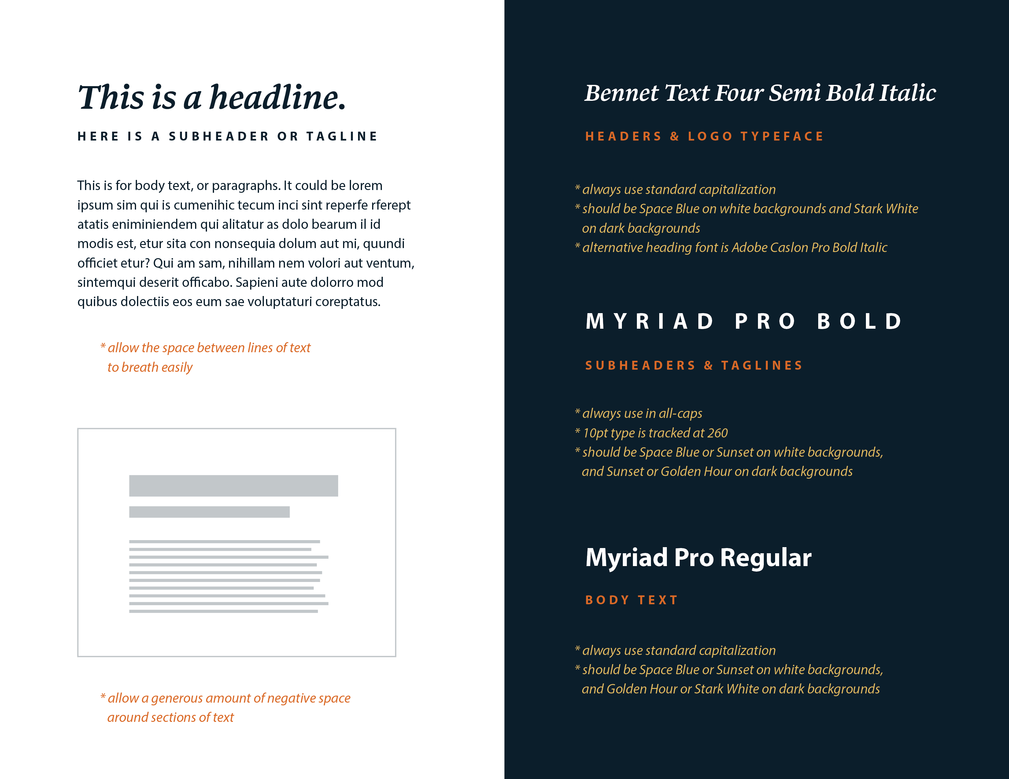
The final design was a friendly, inviting logo that could be adapted for a variety of uses. From the logo design, the visual identity was developed. The color palette was very important in maintaining the brand feelings, with the deep navy blue and warm orange and yellow playing a large role.
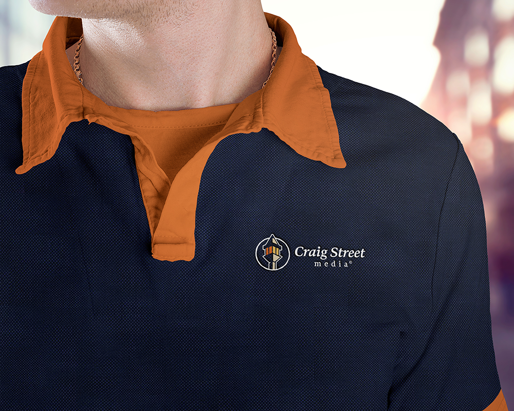

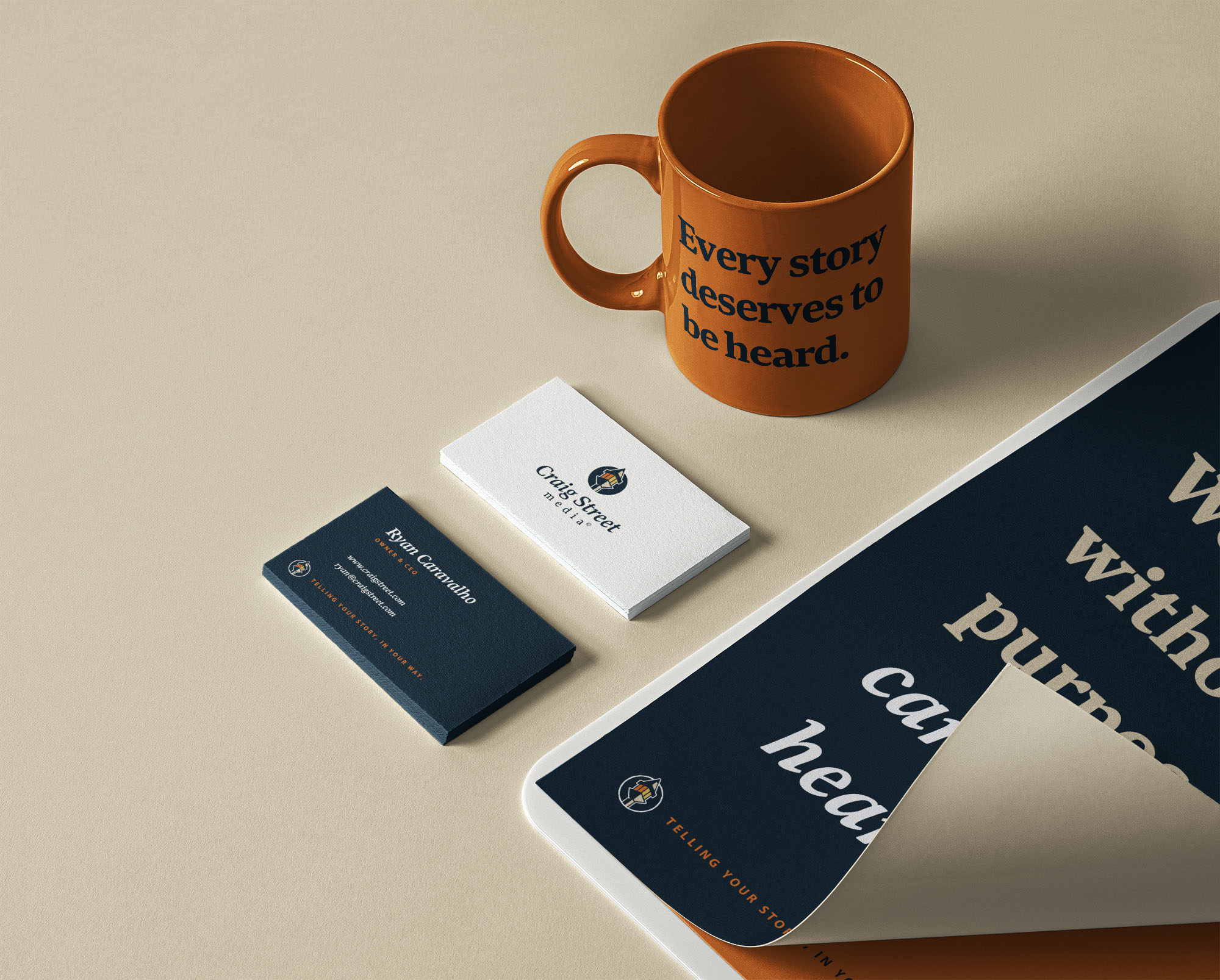
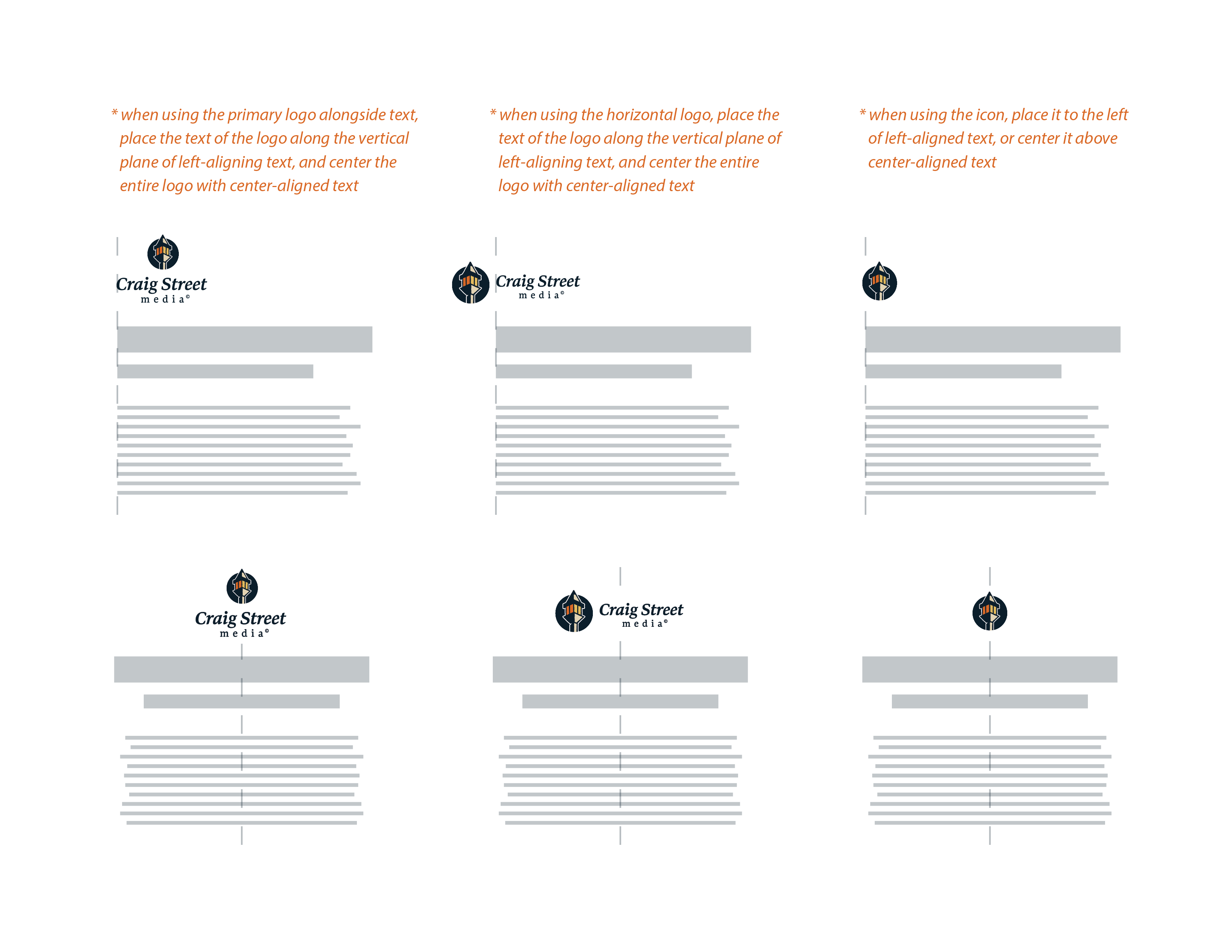
In order to maintain visual consistency, Craig Street Media was provided with a guideline for using their new identity moving forward. It covered the logo variations to use, placement guides, color palette, and typography usage.
“This is legit the first time I’ve ever worked with an outside designer and didn’t have any revision notes… Working with Madison on this logo design project was an absolute joy from start to finish. Amazing results in a short time frame and I couldn’t be happier. Wonderful creativity and balance of artistry and professionalism.”
– RYAN CARAVALHO, Owner
Alternative Logo Concepts
For each branding project, at least three concepts are presented to the client. Every concept provides a solution to their needs, but gives a range of visual direction the client can choose from. For Craig Street Media, the alternative concepts included a corporate, minimal logo and an abstract, colorful option.
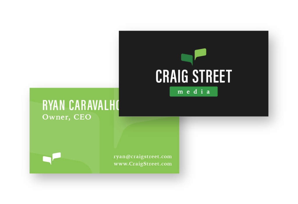
This concept is a more abstract interpretation of street signs, which, like Craig Street Media, help guide people’s way. The icon is a combination of two street signs, altered to also be viewed as conversation bubbles, alluding to a company’s story being told.
The typography is a modern, corporate selection, paired with bold colors that signify growth and direction.
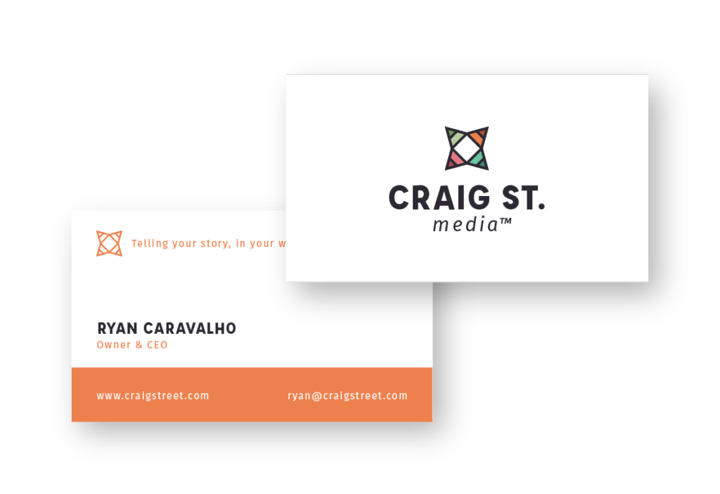
This concept is a strong symbol, based off three ideas. The icon is an aerial view of an open box, a nod to the creative marketing approach of Craig Street Media. It’s also comprised of four pencil tips, all pointing outward, an indication of stories being shared. And finally, the icon is reminiscent of a compass, hinting at how Craig Street Media helps guide it’s client’s marketing efforts.
The typography is a blend of friendly and professional, making it feel like an approachable company. The color scheme is warm and diverse, showcasing the unique blend of clients Craig Street Media has.
