SASSY BIRCH SNACKS
Identity Design
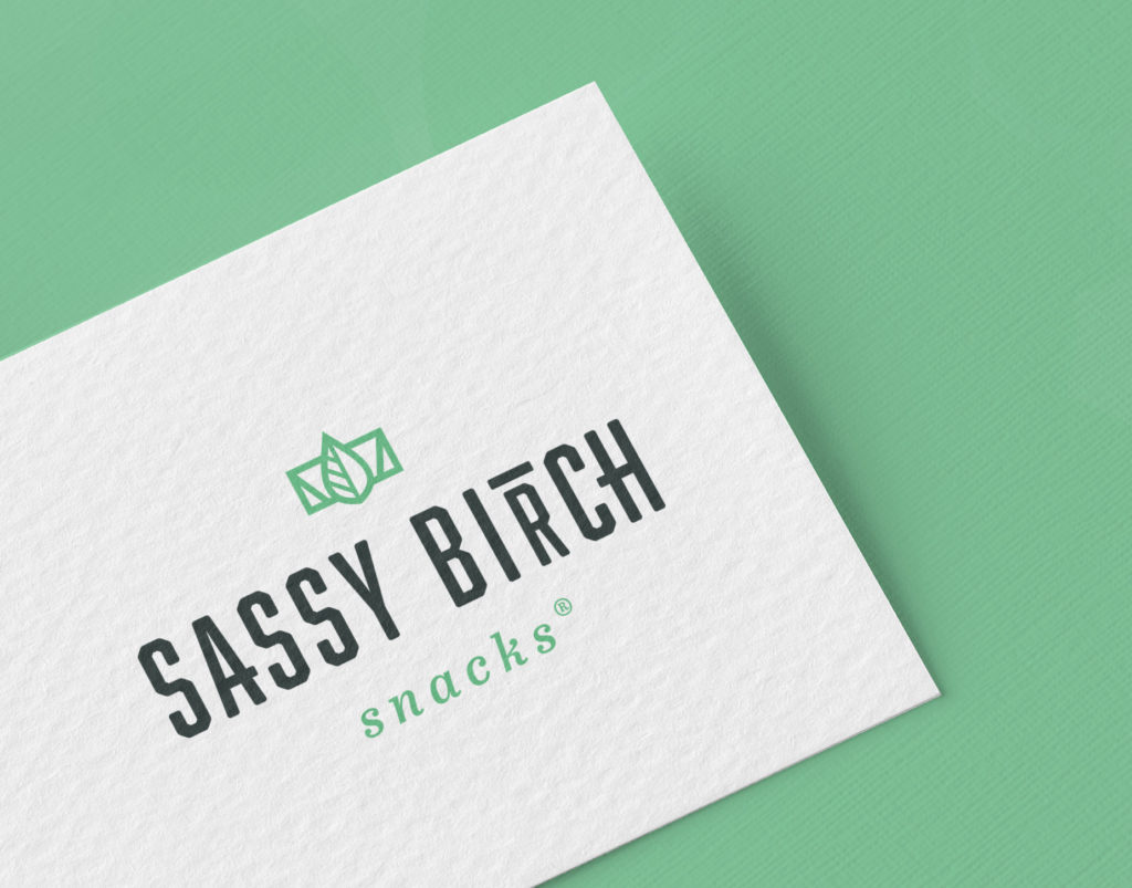
In a world where there are millions of snack options, a new product entering the scene needs to stand out on the shelves. But before packaging can be thought of, there needs to be a logo that can support a visual identity. This is what Sassy Birch Snacks was looking for. In the initial consultation with owner Kristina Breuninger, a few key words jumped out that would provide creative direction for the logo and identity.
BOLD MINIMALISTIC EYE-CATCHING PUNCHY
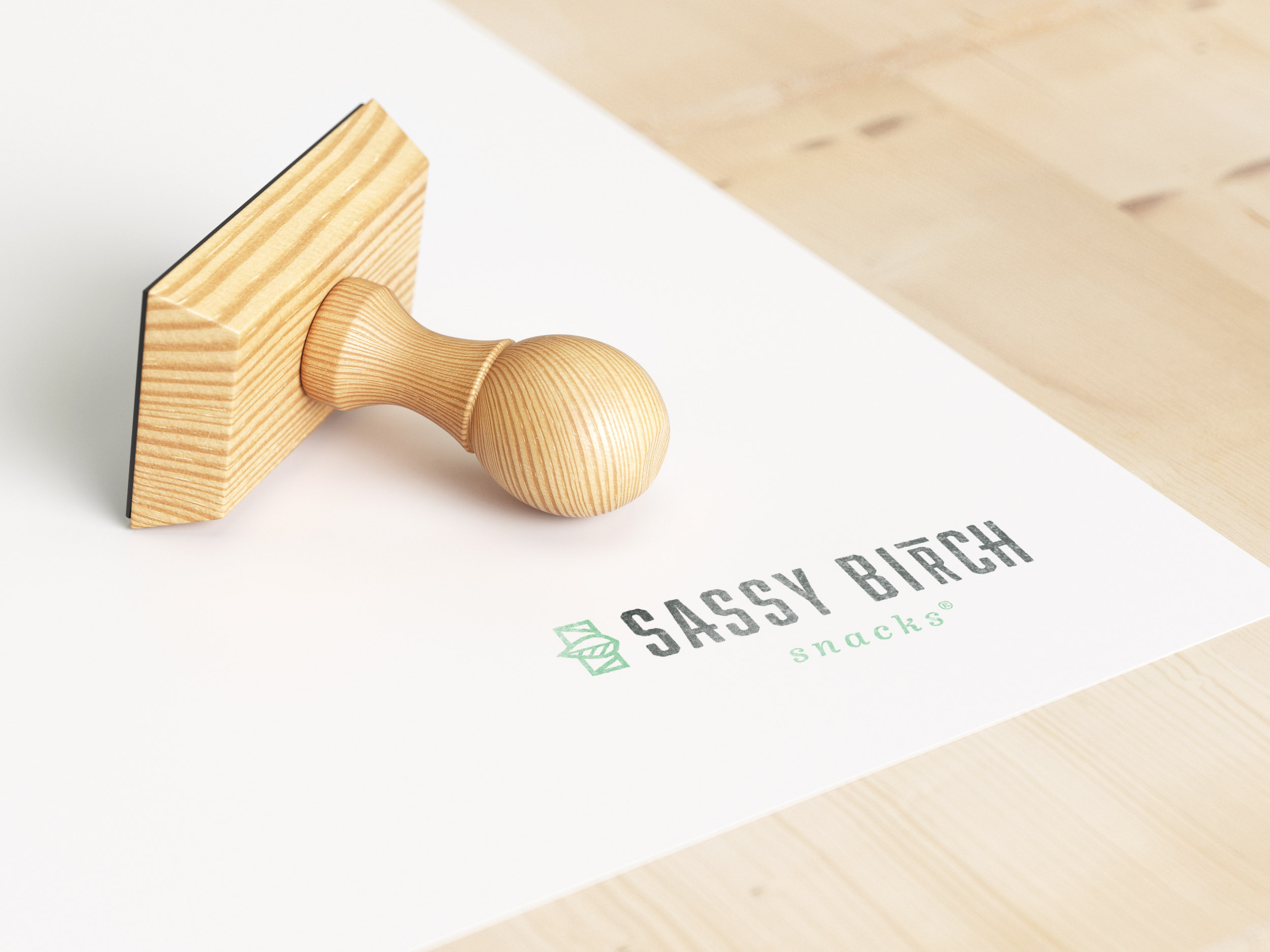
Kristina also shared that she really wanted a logo that had some options in it’s usage. To satisfy this need, it was decided an icon coupled with a unique wordmark would be the best way to provide flexibility. Drawing inspiration from a birch leaf, a simple line icon was developed, coupled with a bold font. Kristina also wanted the R in “birch” to be subtly read as a T, which was achieved by shrinking the R and placing a bold line at it’s top. This horizontal line would also be worked into a monogram option.
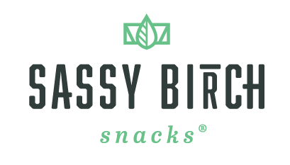
PRIMARY LOGO
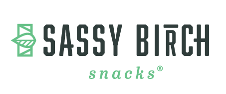
HORIZONTAL OPTION
VERTICAL OPTION
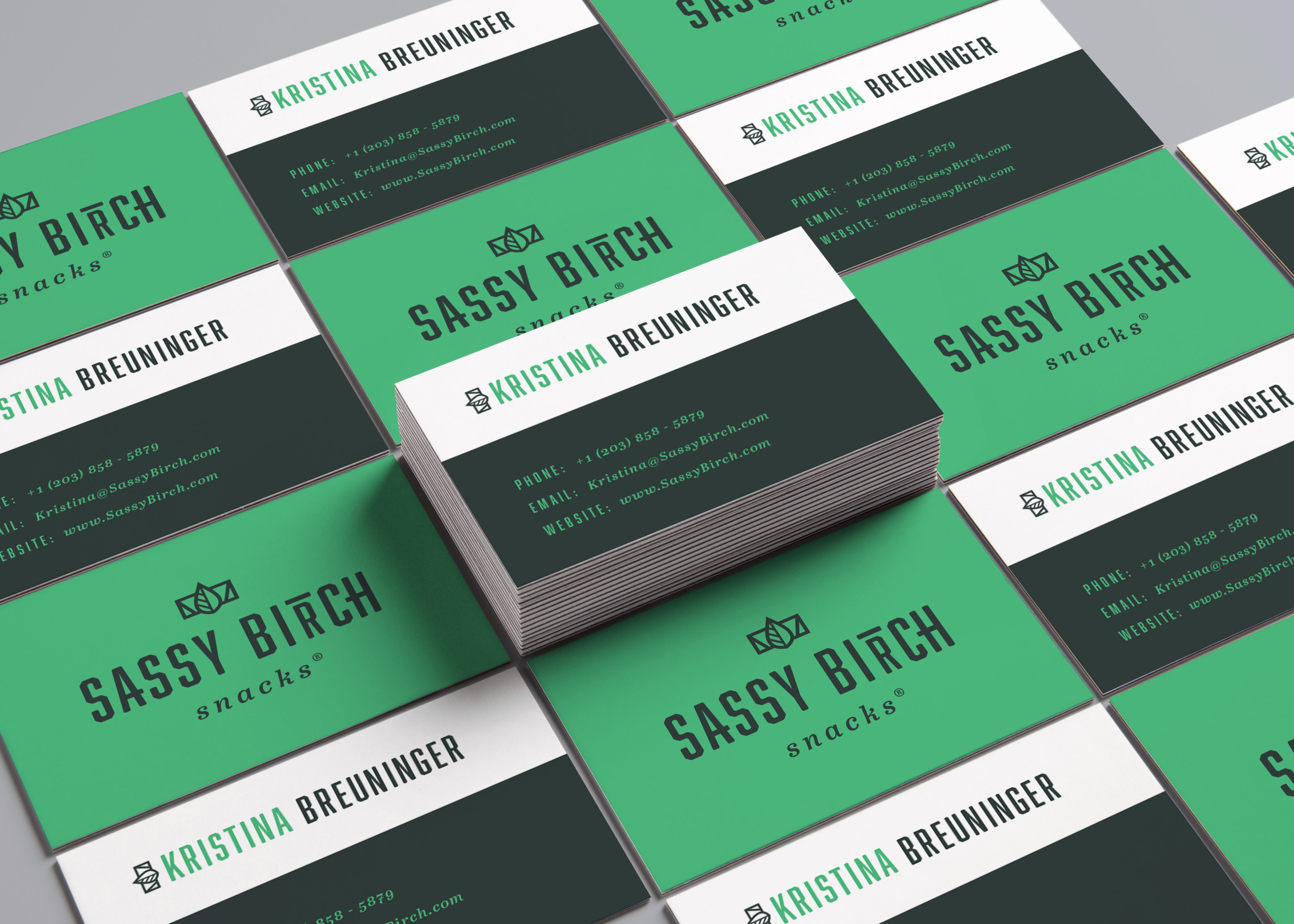
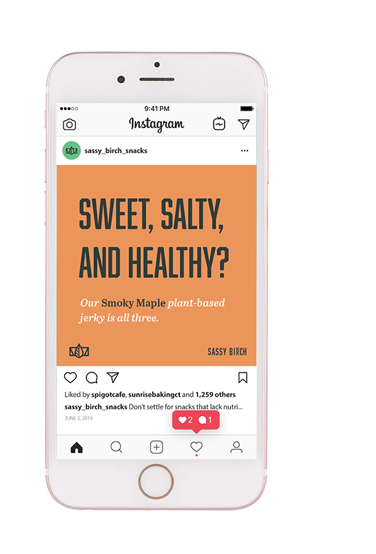
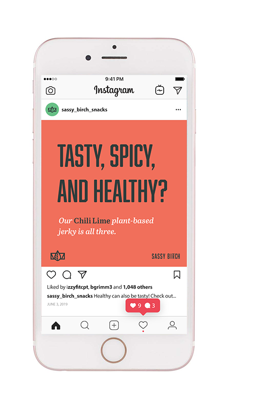
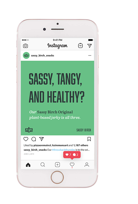
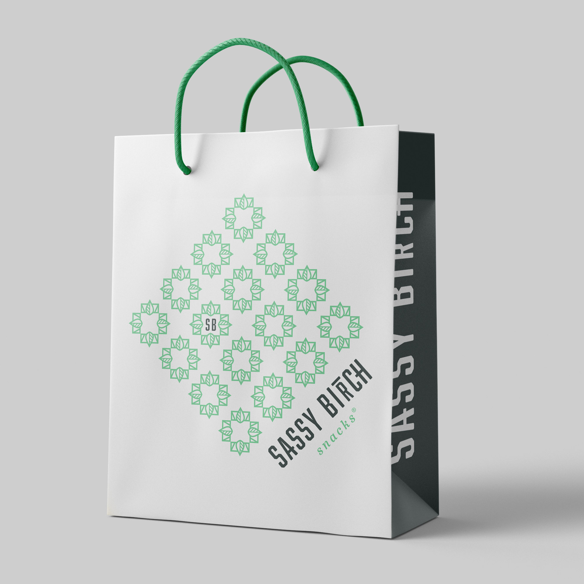
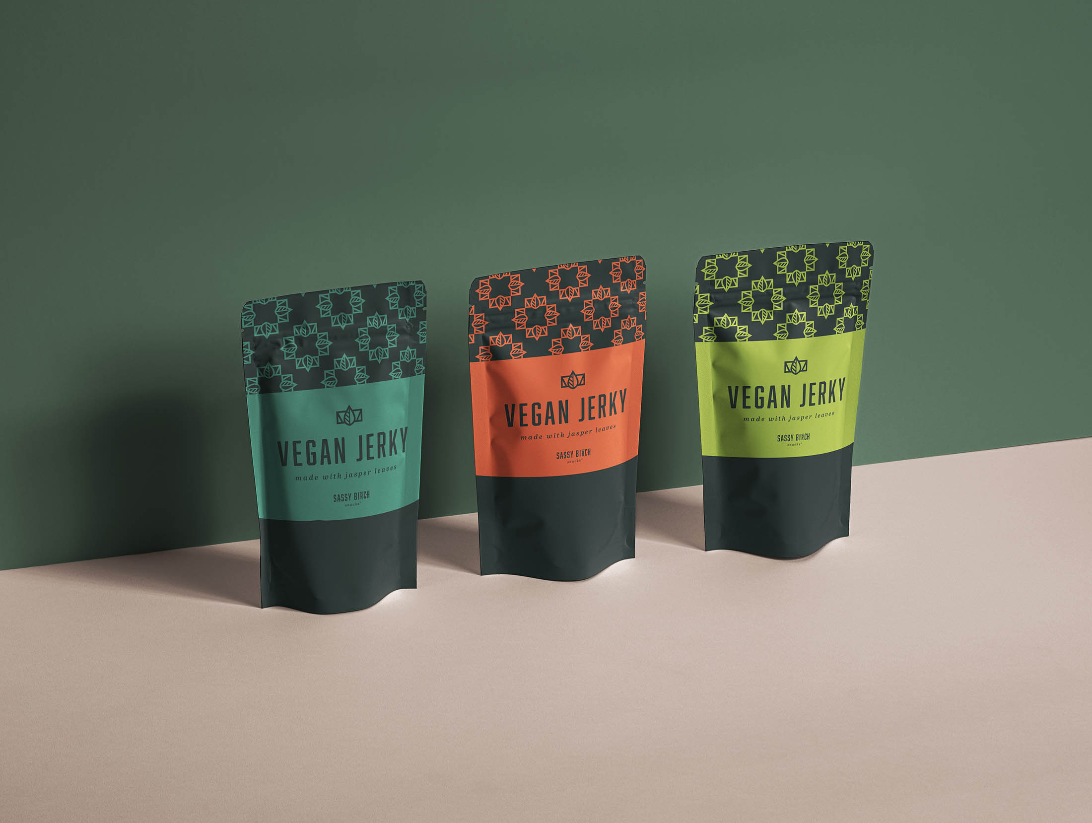
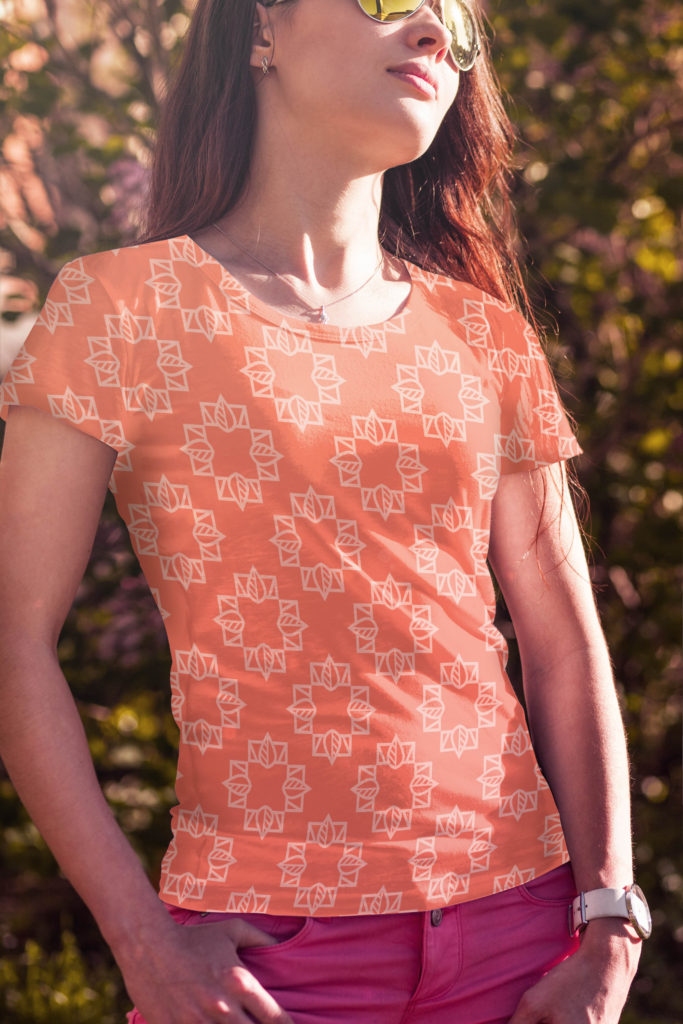
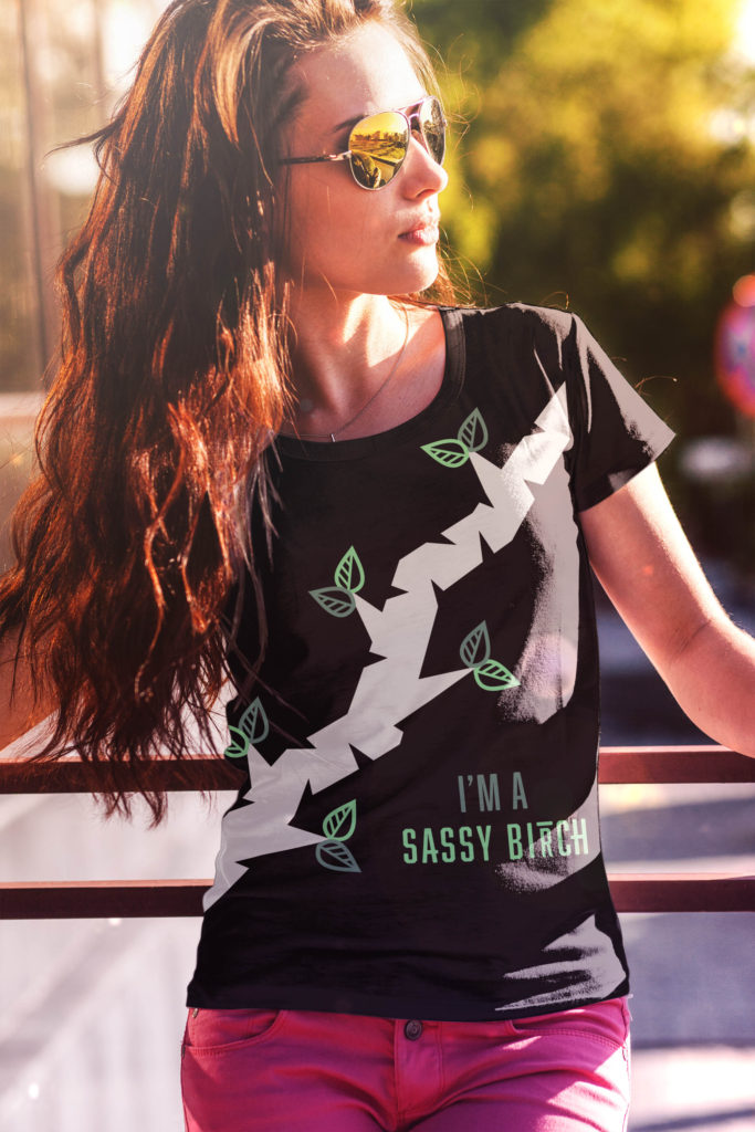
After the logo was established, a visual identity system was developed for Sassy Birch. To accompany the moss green of the primary logo, a deep green, soft orange and salmon red was added to the color palette. Another benefit of having an icon that could be extracted from the main logo was the versatility it provided. When multiplied and rotated, it could form another supportive element to be used in a monogram format. And by multiplying the four-leaf element, a pattern was formed to be used in marketing collateral and packaging options.
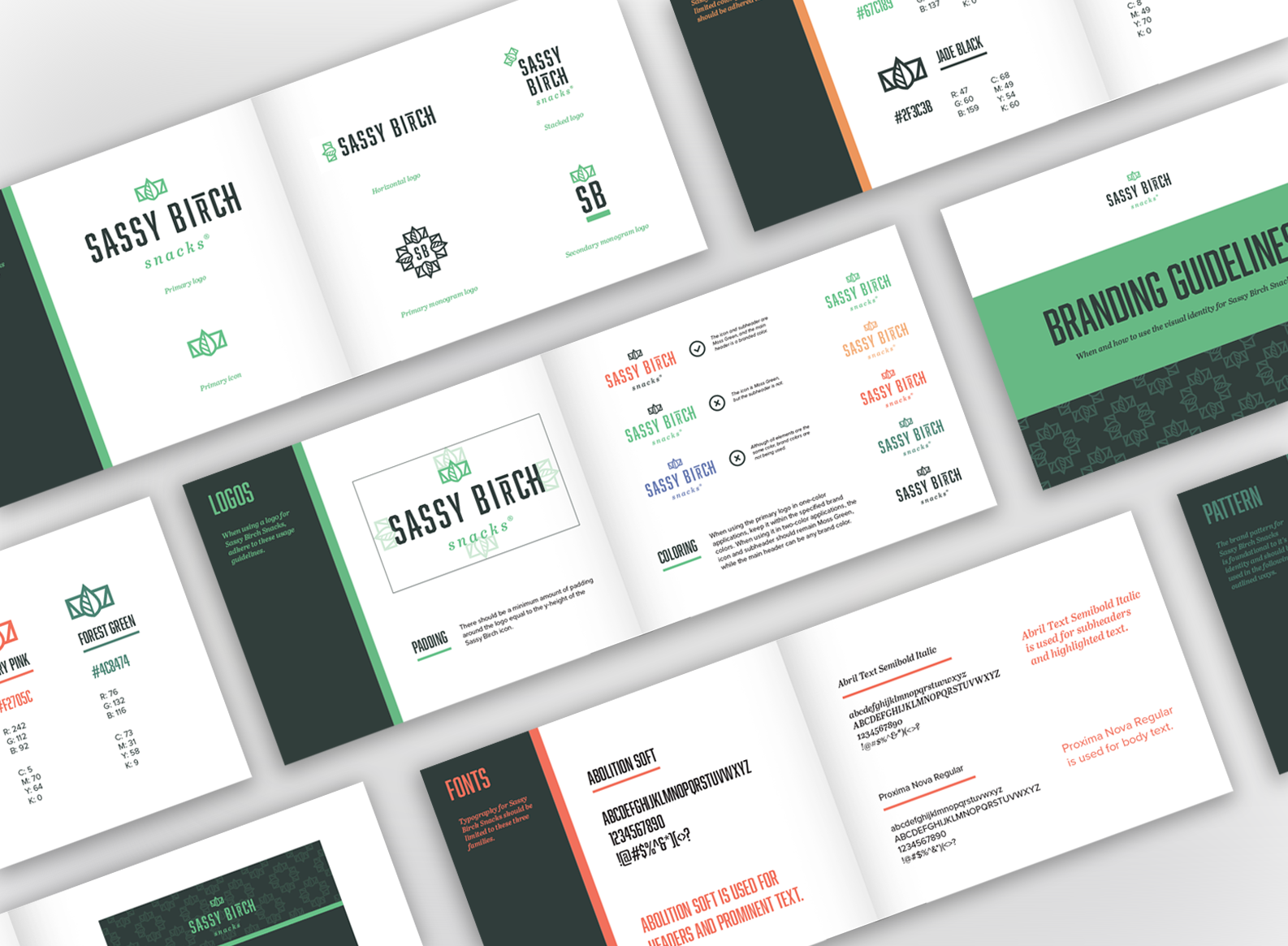
At the end of an identity project, a brand guideline is developed to ensure that the identity is used with consistency. The guideline includes rules on the colors, typography usage, where and how to use different logo layouts, and the manner in which to use the brand pattern.
Additional Collateral


Alternative Logo Concepts
For each branding project, at least three concepts are presented to the client. Every concept provides a solution to their needs, but gives a range of visual direction the client can choose from. For Sassy Birch Snacks, the alternative concepts included a retro, hand-lettered logo and an illustration-based identity.
