Every startup will reach a point in their journey where they need to make a pitch. Sometimes it’s just to get your family on board with your dreams. Sometimes it stands between you and a $1,000,000 investment. Presenting a business plan can be daunting, and the last thing you want is a deck that works against you. The way you design your deck can either help or harm your presentation. We’re going to cover 4 tips that can help you design a killer deck and rock your next pitch.
1. Isolate information.
Have you ever sat through a lecture where each PowerPoint slide is crammed with fifty single-spaced lines? It can seem like the presenter is trying to fit all their notes on one slide, and as a viewer, it makes it very difficult to focus on the content of the presentation.
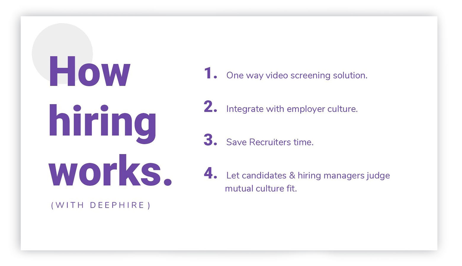
When laying out your deck, try to maintain one main idea per slide. And if you have a lot of body text, see if it can be edited into bullet points or one-liners. A rule of thumb in presenting is that if your audience is reading it, then they aren’t listening to you. You never want your audience to tune you out. The deck is there to hit the main points and keep the listener focused on what you’re saying.

In addition to keeping information short and sweet on each slide, you also want to visually isolate information within the slide. Cramming text and graphics together is just asking for a confused viewer. Negative space is a designer’s best friend, so don’t be afraid to let things breathe and have generous margins.
2. Pictures speak a thousand words, but those words can be bad.
I’ve encountered more than a few decks that utilize pictures, but instead of helping the presentation, it bogs it down with it’s low-quality. Or worse, it doesn’t quite match the rest of the content! Stock photos are a wonderful tool, so don’t be afraid to invest in quality pictures. But make sure it helps your content instead of fighting against it.
For example, if you are talking about your target audience, it can be helpful to include a picture of what they look like, i.e. college students, mothers with babies, or seniors. But if your target audience is expectant mothers, and you show a diverse picture that includes people from every age range, then you’re setting your viewers up to be confused.
3. Less is more, especially in color choices.
In wanting to capture the attention of their audience, some people think that using a variety of vibrant colors will do the trick. You’ll tend to leave your viewers with a headache. You can also come across as unprofessional and indecisive. A good rule is to pick one main color, with a complementary color used to accent the most important parts of the presentation.

Since you want your viewers to easily read your text, it’s important to pick a main color that contrasts with the background. So if you’re sticking with a classic white background, (no shame, it’s an excellent choice!) using a dark color will let your text remain legible. If you want to try a light text on a dark background, lean on the side of bigger and bolder text. It strains the eye to read light on dark, especially at a distance.
4. Don’t do something for the sake of doing it.
I come across slides that have pointless graphics or confusing graphs, with the hope that having something will make it look better. It unfortunately does the opposite. Graphs are a wonderful way to convey a large amount of information, but using a pie chart to show a 50/50 divide can come across as rather useless. A deck that is entirely text can look better than one riddled with overbearing graphics and charts.
The old adage, “keep it simple, stupid,” is pretty good advice to apply to pitch decks. If you want to show that 75% of people need your product, forgo a pie chart. You can boldly state the fact with text and make it impactful. A graph would be better served showing how you expect your revenue to grow over a 5 year timeline.
Conclusion
In conclusion, look at your pitch deck through the eyes of your viewer. If you can’t focus when listening to long presentations saturated with poor graphics, then avoid making the same mistakes in your deck. The best way to test out your deck is to practice it on family and friends, and see if they nod off or look bewildered during it. A well-designed deck can capture the attention of a crowd and keep them focused on your content, so it’s important to get it right!

