Being a small business owner means you need to wear multiple hats. You’ll often find yourself stepping into other fields just to make things work. In an effort to equip you wherever you are in your entrepreneurial journey, we’re going to cover four technical terms used in design. Understanding these terms will help you better grasp what your designer is saying. They can also help when you give feedback to your designer, which will be appreciated and lead to better communication.
RGB vs. CMYK
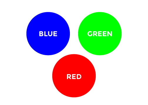
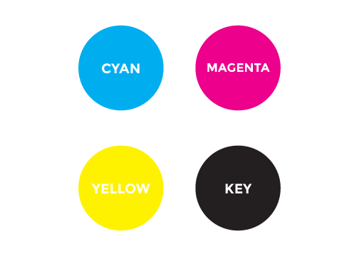
These are two technical terms that most people have heard of in some capacity, but fewer people truly understand what they mean. These acronyms are used in regards to design output. RGB stands for Red, Green, and Blue. CMYK stands for Cyan, Magenta, Yellow, and Key.

RGB is used in any digital output, such as a screen. Every color on your computer screen is a combination of a red light, green light, and blue light. From a young age, we all learn the primary colors; blue, red, and yellow. From these three colors, any color can be created. But that only applies to pigments. Red, green, and blue are the primary colors of light. So when dealing with designs that will be used on screens, it’s important for files to be formatted using RGB. This will result in the most accurate output of the designs.

CMYK is used when the designs will be printed. A four-color process printer uses dots of four ink colors to create all other colors. Cyan is a light blue and magenta a bright pink. Yellow is self-explanatory. Key is another term for black ink. A design that will result in a printed output requires the file to be formatted using CMYK, so the printer is accurate with the colors.
These two terms are important to understand, because they are used often in the design world. And if you find your designing sending over your web design files in CMYK, it can be a red flag that you’ve hired a novice and might run into some issues!
RELATED: 11 Questions To Ask Before Hiring A Designer
Raster vs. Vector
Two lesser-known terms, but extremely important, are raster and vector. These terms relate to how a design is constructed in a digital file. The two primary applications used in design is Adobe Photoshop and Adobe Illustrator. Raster and vector relates directly to these two programs.
Photoshop and Raster
Photoshop is built using raster images: this means that the program remembers everything by pixels. The entire image is built using small dots of colors, and the Photoshop remembers the location of every pixel. This is very useful in dealing with photos, because all digital photos are formatted in raster. So in Photoshop, it’s easy to manipulate and edit photos. The problem is that raster is not scalable. Since there is a finite number of pixels in an image, the quality of the image is related to that number. If an image is 100 pixels by 100 pixels, then it doesn’t have enough pixels to fill up a space that is 500 x 500. If you try to resize it that large, it will be a very bad looking image. So if you require a design that can be resized without losing quality, then you’ll want to use vectors.
Illustrator and Vector
Illustrator is built using vectors, which are mathematical formulas. Instead of remembering where each pixel is, it remembers formulas. This means that you can resize vector images to your heart’s content, and it will never lose quality. Illustrator is not too good at dealing with photos as Photoshop is. It is far superior in dealing with type, because the type can be resized and maintain its quality. Because of this, Illustrator and Photoshop are often used together on design projects, each one playing to its strengths.
The most common encounter a you’ll have with raster and vector is in dealing with logos. It is a sin of design to create a logo in Photoshop, because it can’t be scaled. By their very nature, a logo needs to be used in a whole range of sizes. Your logo could be used as big as a billboard or as small as a business card. Having it designed in vector will allow you to use it wherever it’s needed and not lose any quality.
Conclusion
As you run your business, you’ll probably encounter these terms in some capacity. It’s helpful to understand what they are and how they work with each other. A skilled designer will be able to answer any questions you have about them, but it can put you ahead if you already have a baseline understanding of them. In the next article, we’ll cover four terms that can help you better grasp the principles of what makes good design.

