Everyone wants their logo to be the next Nike swoosh. In fact, that’s how many of my clients describe their ideal logo. They’ll say, “I want a minimalistic, iconic, abstract, recognizable logo. Just like Nike’s logo!” I’ve explained to far too many people that slapping an abstract shape on a plain black hoodie does not allow you to sell it for $300 as a “brand name” hoodie. The problem with pursuing that, which I have to inform them of, is that the Nike logo works primary because of the millions of dollars of marketing that’s been spent on it.
But that being said, the Nike swoosh is widely recognized as one of the best logos. If it wasn’t, it wouldn’t be one of the most referenced logo for all my clients. So, beyond the marketing that has turned the logo into the face of successful brand, what makes the swoosh great? We’re going to look at a few of what I believe are the best logos and derive 4 things that make them successful. I encourage you to bring up your business’ logo and see if it passes the test as well!
1. It’s simple.
This will be the most common trait among successful logos. Your logo doesn’t have to be as bare as Target, but the simpler the logo, the easier it is to remember. This is essential when you want to build brand recognition. Everyone can remember what the Apple logo looks like, so when you see it on the back of a phone in the scene of a movie, you immediately know the character is using an Apple phone.
But let’s say they decided to make their logo an entire apple tree with a dozen apples hanging from it. It wouldn’t look good if it’s tiny and engraved on the back of the phone, and you’ll have a hard time remembering what it looks like. The age-old saying, “keep it simple, stupid,” is very relevant to logo design. It is more important for a logo to be memorized quickly than for it to convey everything about a company. That leads to the second trait of a great logo.
2. It reflects your brand.
Many businesses start out thinking their logo needs to encompass everything about their company. But if you look at the most famous, successful logos, you’ll see that hardly any of them provide a full commentary about the company. Instead, they reflect the primary brand aspect of the company. Fisher-Price has a great logo that does this.

It’s a wordmark on top of a shape, and it’s become a widely recognizable logo. For a toy company, you might expect to see teddy bears and building blocks. Or at least the full spectrum of the rainbow. But Fisher-Price has pursued the simple route. The font is playful, but still legible at any size. The scalloped shape doesn’t scream “crazy fun.” It rather looks like the scalloped tent of a circus, or the negative shape looks like waves and movement. Having a logo that touches on a wider aspect of your company will lead to a better logo that can support your brand. It also allows you to address the next trait:
3. It can evolve with your brand.

There’s another problem with a logo that directly depicts what your company does. It backs you into a corner. Let’s say Apple had a logo that was the icon of a computer. What would’ve happened when they grew and started producing phones? Their logo wouldn’t be able to support their brand. If you have a lawn care business, you might go for the logo that’s of a man riding a lawn mower. But let’s say you expand into landscape design. You don’t want people to think of you as the business that only cuts grass. You might want position yourself as the company that can enhance any outdoor environment. Your logo can’t evolve with your brand, so you’ll find yourself shopping for a new design.
4. It’s unique.
The worst thing you can have when trying to build brand recognition is a logo that looks like everyone else’s. There’s a trend for logos at the moment, specifically in the tech industry, of a lowercase, sans-serif wordmark. Look at AirBnB, Spotifiy, Google, or Mastercard. They have all undergone rebrands that eliminated a unique font and have conformed to this sans-serif “modern” trend. The only reason they were successful is because they already had brand recognition, and they all had other elements that identified their logo. (On a side note, AirBnB is personally one of my favorite rebrands. While their font choice was rather trendy , I think their entire rebrand was fantastic!)

When the large companies start doing something, the small companies follow suit. So now, after these recent rebrands, tech startups are now all receiving the sans-serif treatment. But the problem is now all these companies look the same. There’s nothing to distinguish one from another. A good logo, even those that are just wordmarks, has some element to it that makes it stand out from the competitors.

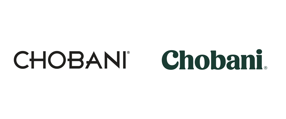
Chobani is a great example. Although I’m not a fan of yogurt, I absolutely love their logo. They’ve headed in the opposite direction of the trend. Their original logo was a mono-weight sans-serif wordmark. They could’ve easily followed in the steps of Gap’s (unsuccessful) rebrand and turned their tall, thin wordmark into a chunky sans-serif font. But they instead created a playful, classic serif font. I think it would be a finalist for best rebrands in the last decade. (If you want to see more of the rebrand, check out this great post!) This new logo is simple, reflects their brand position, is memorable, and stands out on the shelves. It almost makes me want to buy some yogurt!

Conclusion
Ultimately, a logo is only successful if the public responds well to it. There are many examples of good logos that got rejected for a variety of reasons. But if you want a shot at having a great logo, then these traits need to be a factor. Of course, a logo is only the starting step of building a brand. You’ll also need a brand position, a brand strategy, a visual identity… Don’t worry if all of that starts to make your head swim! You can learn more about everything brand-related right here on this blog. Check it out!

