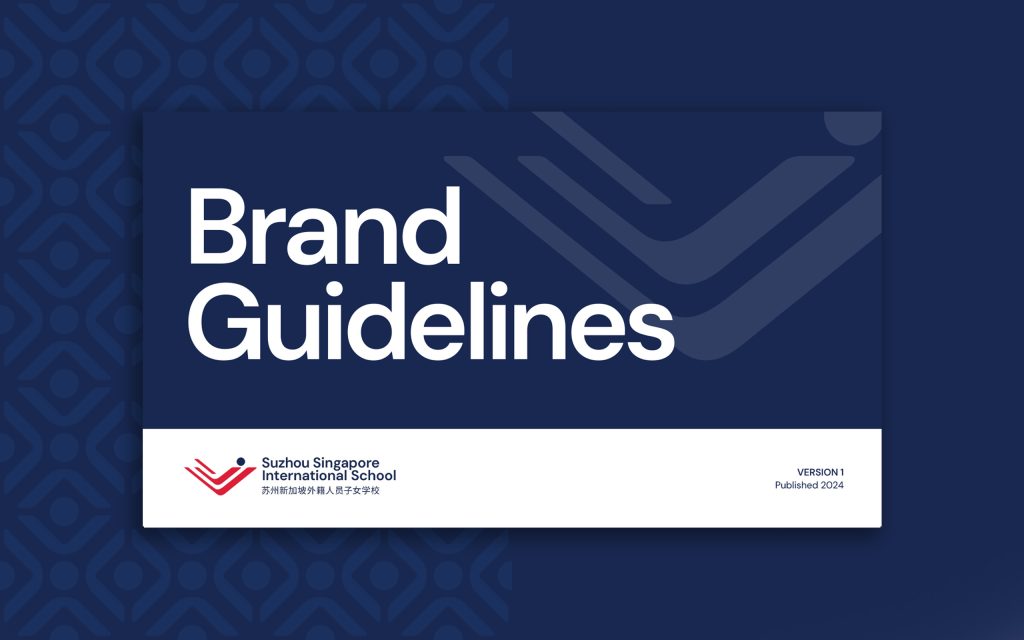
When looking at a school, prospective parents are hoping to quickly develop a sense of trust. And for the school, having a consistent presentation and messaging is the foundation of building long-lasting trust. But for too many schools, the marketing team has little to no guidance on how to consistently present the brand. This leads to a wide variety of visual styles, differing logo usage, disjointed aesthetics, and overall frustration.
What’s the solution to a directionless marketing department? Every school should have a brand style guide to give the internal team a true north and distinct parameters for strengthening and supporting the brand.
Here’s 4 things that should be in every school’s brand guidelines, helping to ensure consistency and a foundation of trust.
1. Brand Strategy Overview
You may be thinking that brand strategy is only a necessary conversation within your leadership team. It’s true that it’s developed and agreed upon with a small group of decision-makers, but once it’s solidified, it should be put before your entire team in digestible ways. Having a brand strategy overview in your brand guidelines will help your school buy into the bigger vision of the brand. It helps align the ship internally, so all the choices that show up externally are moving towards the same goal.
You’ll want to pull back the curtains for your team, especially on the strategic decisions that will impact marketing efforts. You’ll want your marketing team to understand things like your ideal brand position, your key differentiators, and your target audience. They’ll be able to make more informed decisions as they help amplify the school’s messaging and position through the internal and external marketing efforts.
2. Logo Usage
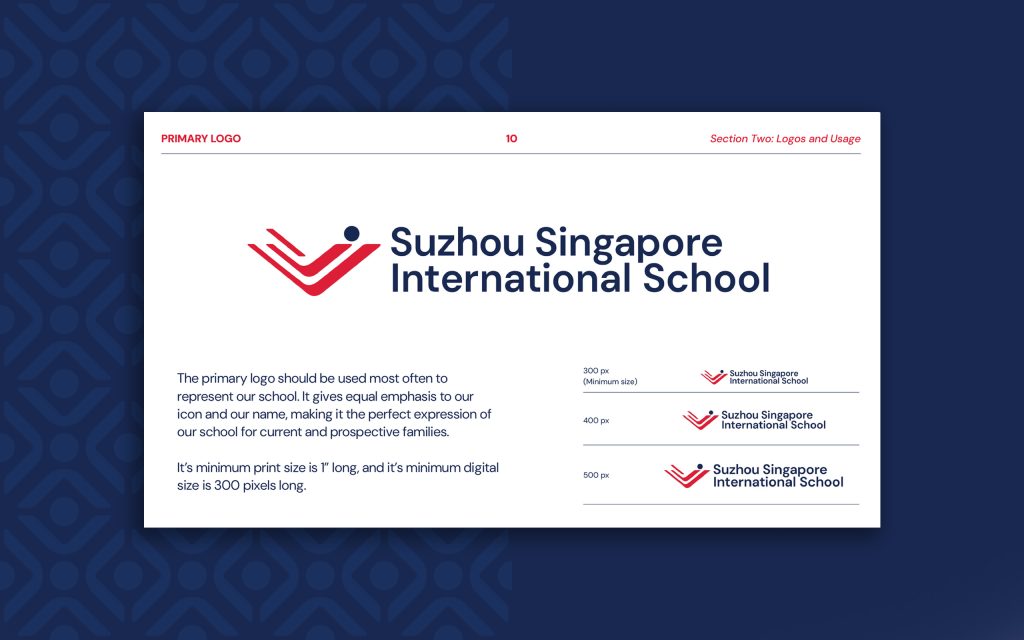
So you have a logo…but is it being used well and effectively? A logo is the cornerstone visual element of your brand, it becomes synonymous with your school. Ensuring it is used properly and professionally is key in helping position your school as a trust-worthy establishment.
A good brand identity system will have a defined primary logo, the one used most often, and then a handful of logo variations. These are not different logos, but rather different orientations to accommodate a variety of spaces and use cases. Having this logo library defined will equip your marketing team to best present your school, no matter where it needs to show up.
3. Color Palette
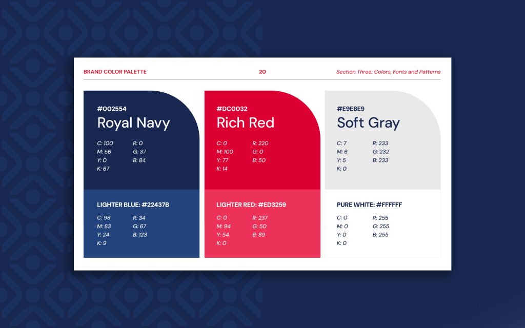
Behind the logo, a school’s colors will quickly become tightly associated with who you are to your community. Colors evoke emotions and perceptions, so having the right colors selected for your school has long-lasting impact. It also is important to have consistent use with your school’s colors.
It’s always best practice to have a limited and thoughtful color palette. Too many colors becomes like too many cooks in the kitchen. Most schools will benefit from having one or two foundational colors, with one or two accents used more sparingly. Within the brand guidelines, there should also be rules on whether or not tints and shades of the brand colors are allowed, if gradients are acceptable, and how to pair brand colors together.
4. Typography Usage
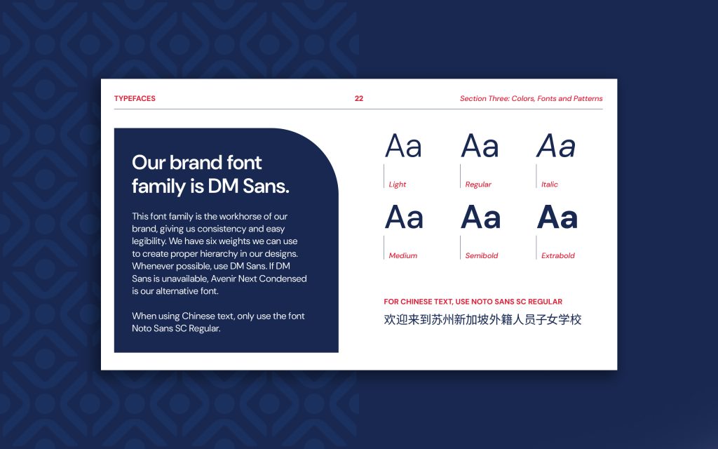
A vital part of having good messaging is the way the words are presented to your audience. Typography is the vehicle of a school’s voice. There are two primary goals for a school’s typography: great legibility and proper style.
Many schools go with flashy typefaces because they think it will be eye-catching. But they fail to see that many loud and busy typefaces can lead to hard-to-read text, undercutting the effort of communicating with an audience. Great type does not have to be boring, but it has to be functional. It also should visually reflect the personality of your school. Once your school has brand typography selected, your brand guidelines should also define consistent usage. Having rules for how to style headlines and quotes and body text will help ensure all your school’s collateral is clear, effective, and on brand.
Does your school have helpful brand guidelines?
A school’s brand requires care to remain consistent and effective. Brand guidelines are at the heart of that effort, giving your whole team alignment and clarity on how the school should be presented. If you do not have guidelines, or your guidelines are missing these key parts, you’ll find a lot of frustration and confusion from your marketing team.


